In our first article in a series on Data Visualisation, we discuss how to create a Pie Chart in SAS. We start with the basics and explain step-by-step how to customize the Pie Chart with titles, a legend, labels, etc. We use SAS code to show how to build the Pie Chart. At the end of this article, you will be able to create a Pie Chart such as the one below.

Contents
Sample Data
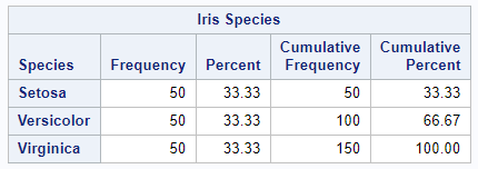
Throughout this article, we will use the famous Iris Flower data set from the SASHELP library. The data set consists of 50 samples from each of the three species of Iris (Setosa, Virginica, and Versicolor). Below we show a frequency table of the evenly distributed species.
Create a Basic Pie Chart
In this article, we will use the PROC TEMPLATE procedure to create a Pie Chart in SAS. With this procedure, we define the chart. To actually show the chart on a screen we use the PROC SGRENDER procedure.
The define statgraph statement is the first statement within the TEMPLATE procedure. Following this statement you specify the name of the template; in this case my_pie_chart. When you generate the chart with the SGRENDER procedure you use this name to refer to the template.
Then, between the begingraph and endgraph statements, you specify how your chart will look like. So, here you can define the actual chart type, the title(s), colors, etc.
In our first example, we only want to show a default Pie Chart. Within the layout section of your template, you use the piechart statement to define the chart type. Next, with the category option, you specify the categories of the Pie Chart. In our case, the Iris Species are our categories.
Finally, with the SGRENDER procedure, you create the chart. With the data option and template option you define the data set and template that must be used to create the chart. The code below shows how to create a basic Pie Chart in SAS.
proc template;
define statgraph my_pie_chart;
	begingraph;
		layout region;
			piechart category=Species;
		endlayout;
	endgraph;
end;
run;

proc sgrender data=sashelp.iris
              template=my_pie_chart;
run;
Add Titles to a Pie Chart
As the above image shows, a basic Pie Chart in SAS doesn’t contain titles. You can use the entrytitle and entryfoornote statements to add a title and footnote, respectively. These statements need to be placed inside the graph section, but outside the layout section. As with other titles in SAS, you can use macro variables in these statements.
proc template;
define statgraph my_pie_chart;
	begingraph;
		entrytitle "Pie Chart of IRIS Data";
		layout region;
			piechart category=Species;
		endlayout;
		entryfootnote "Graph created: &SYSDATE9.";
	endgraph;
end;
run;

proc sgrender data=sashelp.iris
              template=my_pie_chart;
run;
Add a Legend to a Pie Chart
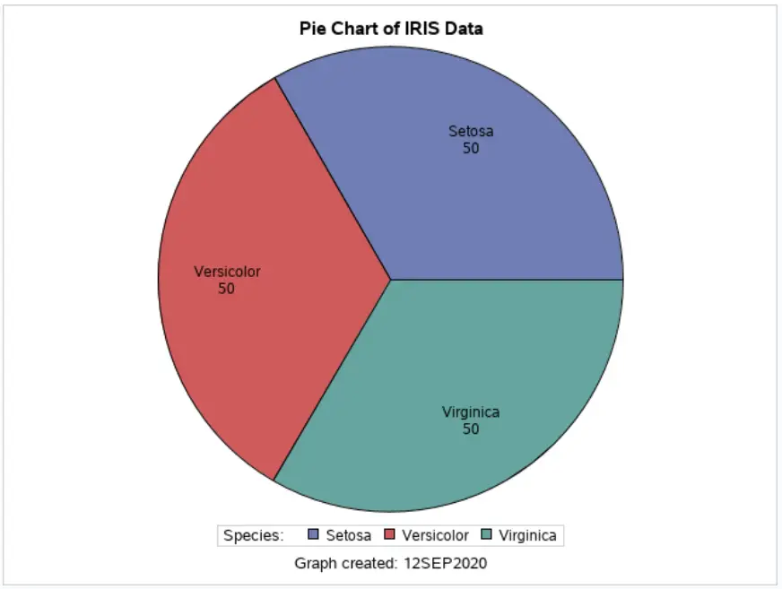
The second enhancement of our basic Pie Chart is a legend. You use the discretelegend statement to add a legend to a Pie Chart. A legend is always linked to a chart. To link the chart and legend, the chart needs to have a name. So, in the piechart statement, you need to add the name option and give the chart a name. Then, in the discretelegend statement, you specify the name of the chart. In this example, the name of the Pie Chart is “my_piechart”.
By default, the legend shows only the names and colors of the categories in the chart. To add a text to the legend you use the title option. In this example, the title of the legend is “Species: “.
proc template;
define statgraph my_pie_chart;
	begingraph;
		entrytitle "Pie Chart of IRIS Data";
		layout region;
			piechart category=Species /
				name="my_piechart";

			discretelegend "my_piechart" /
				title="Species:";
		endlayout;
		entryfootnote "Graph created: &SYSDATE9.";
	endgraph;
end;
run;

proc sgrender data=sashelp.iris
              template=my_pie_chart;
run;
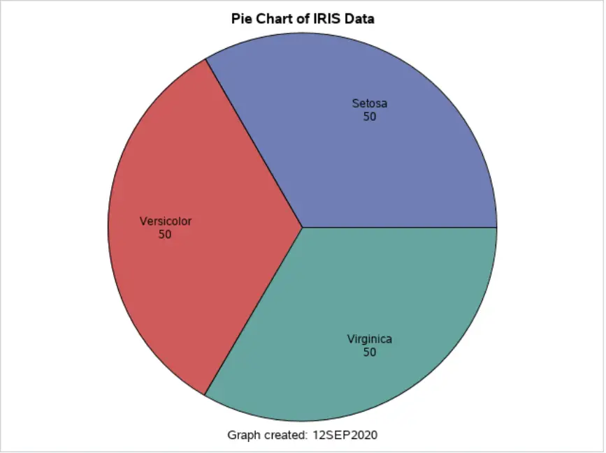
Change the Labels of a Pie Chart
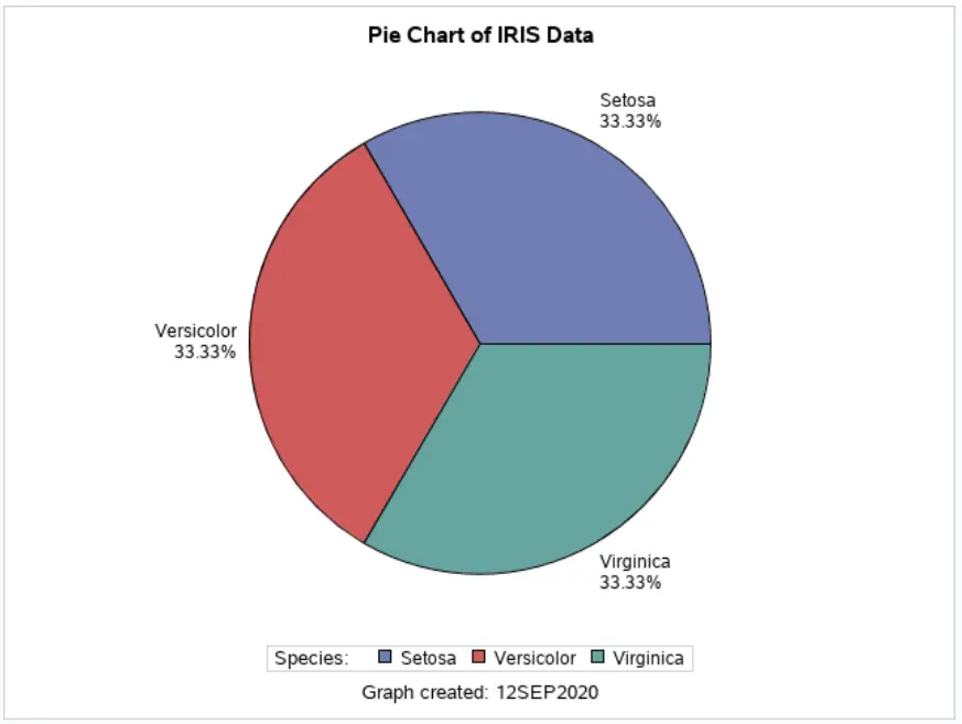
By default, the SAS Pie Chart shows the category name and its frequency inside the chart. You can change this default behavior with the datalabelcontent and datalabellocation options.
The datalabellocation option defines where the labels are placed. You can use the keywords inside and outside. By default, SAS places the labels at the inside.
With the datalabelcontent option, you define what information the labels contain. You can use the following options:
- ALL: To show the category name, frequency, and percentage.
- STANDARD (Default): The show the category name and frequency.
- NONE: To show nothing:
- (category, percentage): To show the category name and percentage.
- (response, percentage): To show the category frequency and percentage.
In this example, we will show the category name and percentage outside of the Pie Chart, see the SAS code below.
proc template;
define statgraph my_pie_chart;
	begingraph;
		entrytitle "Pie Chart of IRIS Data";
		layout region;
			piechart category=Species /
				name="my_piechart"
				datalabelcontent=(category percent)
				datalabellocation=outside;

			discretelegend "my_piechart" /
				title="Species:";
		endlayout;
		entryfootnote "Graph created: &SYSDATE9.";
	endgraph;
end;
run;

proc sgrender data=sashelp.iris
              template=my_pie_chart;
run;
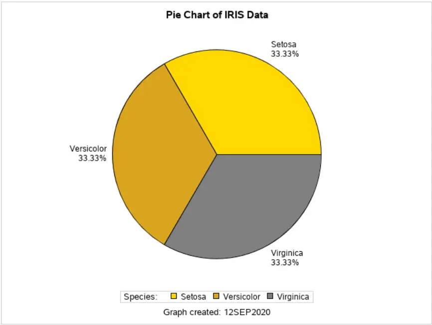
Change the Colors of a Pie Chart
Finally, we explain how to change the colors of a Pie Chart. Although, changing the colors in a chart requires some coding, the results can be beautiful.
To start, you need the discreteattrmap to define the color of each category (species). You give this color mapping a name with the name option. With the value statement and the fillattrs option, you specify the color for each category. On this page, you can find a list of available colors.
Next, you apply this mapping to the category variable with the discreteattrvar statement. With the attrvar option, you define the name of the new variable with the applied color mapping. The var option is used to specify to which variable the mapping must be applied. With the attrmap option, you specify which mapping must be applied.
Finally, you need to change the category option in the piechart statement.
proc template;
define statgraph my_pie_chart;
	begingraph;

		discreteattrmap name="piecolors";
		  value "Setosa" / fillattrs=(color=Gold);
		  value "Versicolor" / fillattrs=(color=Goldenrod);
		  value "Virginica" / fillattrs=(color=Grey);
		enddiscreteattrmap;
		discreteattrvar attrvar=species_mapped var=species attrmap="piecolors";

		entrytitle "Pie Chart of IRIS Data";
		layout region;
			piechart category=species_mapped /
				name="my_piechart"
				datalabelcontent=(category percent)
				datalabellocation=outside;

			discretelegend "my_piechart" /
				title="Species:";
		endlayout;
		entryfootnote "Graph created: &SYSDATE9.";
	endgraph;
end;
run;

proc sgrender data=sashelp.iris
              template=my_pie_chart;
run;

3 thoughts on “Learn How To Create Beautiful Pie Charts in SAS”
Comments are closed.