This is the fourth article in our series on how to create Graphs and Charts in SAS. In this article, we demonstrate how to create an attractive Time Series plot in SAS in just 5 steps. All steps are supported by images and SAS code examples.
Throughout this article, we will use the Stocks data set from the SASHELP library. The data set provides the performance of three stocks (Microsoft, IBM, and Intel) between 1996 and 2005. For our Times Series plots, we will only use the Closing Price of the stock from 2000 and onwards.
Contents
The TEMPLATE and SGRENDER Procedure
In this article, we use the TEMPLATE and SGRENDER procedures to create the Time Series plot. With PROC TEMPLATE you can control the structure and appearance of the ODS output of tables graphs, etc. We will focus on how to define a template of statistical graphs.
Below we show a template for a statistical graph. First, we use PROC TEMPLATE to let SAS know to create a template. Second, we use the define statgraph statement to tell SAS that we create a template of a graph. Since each template must have a name, the define statgraph statement is followed by the name of the template. Then, we use the begingraph and layout overlay statement to start the definition of the template. Finally, we write the code for the graph.
proc template;
define statgraph MY_TEMPLATE_NAME;
begingraph;
	layout overlay;
		/* CODE FOR GRPAH */
	endlayout;
endgraph;
end;
run;

proc sgrender data=DATA
	template=MY_TEMPLATE_NAME;
run;
Once you have created the template, you need the SGRENDER procedure to show the graph. With the data keyword, you specify the data for the graph and with the template keyword, you let SAS know which template to use.
A Basic Time Series Plot
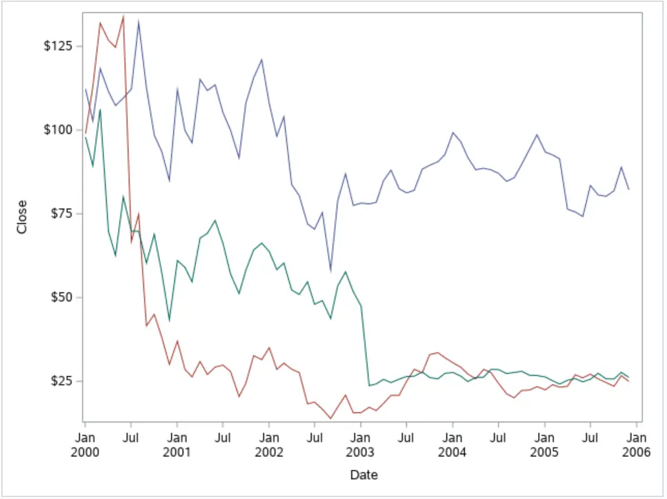
To create a very basic Time Series plot in SAS, you just need the seriesplot statement and the X and Y variables. For example, to create a plot of the daily closing price of the three stocks mentioned before, you use the code below. However, since we have three stocks, we need the group option to create a different series for each one. Also, it’s good practice to give your graph a name (“timeseries_plot“). Later on, we will use this name when we create a legend.
/* A Basic Time Series Plot */
proc template;
define statgraph timeseries_plot_template;
begingraph;
	layout overlay;
		seriesplot x=Date y=Close /
			name="timeseries_plot"
			group=Stock;
	endlayout;
endgraph;
end;
run;

proc sgrender data=sashelp.stocks (where=(year(date)>=2000))
	template=timeseries_plot_template;
run;
Add Titles and Labels
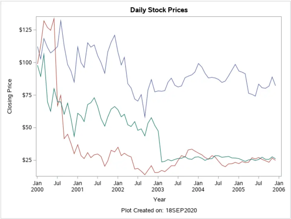
A good graph has a title and labels for the X and Y-axis. With the entrytitle and entryfootnote statement, you can define the title and footnote of the graph, respectively. As with a normal title in SAS, you can use macro variables. For example, in the footnote, we use the SYSDATE9. macro variable to specify when the graph was created.
To modify the X and Y-axis you can use the xaxisopts and yaxisopts. With these statements, you can control the appearance of the axes. However, for now, we only use these statements to modify their labels.
/* Add Titles & Labels */
proc template;
define statgraph timeseries_plot_template;
begingraph;
	entrytitle "Daily Stock Prices";
	layout overlay /
		xaxisopts=(label="Year")
		yaxisopts=(label="Closing Price");

		seriesplot x=Date y=Close /
			name="timeseries_plot"
			group=Stock;
	endlayout;
	entryfootnote "Plot Created on: &SYSDATE9.";
endgraph;
end;
run;

proc sgrender data=sashelp.stocks (where=(year(date)>=2000))
	template=timeseries_plot_template;
run;
Do you know: How to Change the Size, Font, and Color of a Title in SAS?
Add a Legend
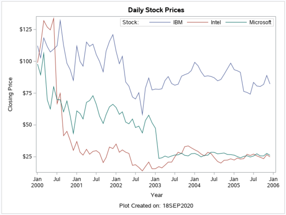
Besides a title and labels, a good graph also has a legend. To create a basic legend, you need the discretelegend statement and the name of the graph it corresponds to (“timeseries_plot“).
The discretelegend statement has many options to specify the appearance of the legend. In the example below, we use some of them. First, we use the title option to give the legend a title. Then, we use the location, valign, and halign to specify the position of the legend. You use the location option to place the legend inside or outside of the graph. With the valign (bottom/center/top) and halign (left/center/right) you specify the exact position. By default, SAS places the legend outside of the graph below the X-axis in the center.
Finally, with the opaque option you specify is the legend is opaque (true) or not (false). The default setting is opaque=FALSE.
/* Add a Legend */
proc template;
define statgraph timeseries_plot_template;
begingraph;
	entrytitle "Daily Stock Prices";
	layout overlay /
		xaxisopts=(label="Year")
		yaxisopts=(label="Closing Price");

		seriesplot x=Date y=Close /
			name="timeseries_plot"
			group=Stock;

		discretelegend "timeseries_plot" /
			title="Stock: "
			location=inside
			valign=top
			halign=right
			opaque=true;
	endlayout;
	entryfootnote "Plot Created on: &SYSDATE9.";
endgraph;
end;
run;

proc sgrender data=sashelp.stocks (where=(year(date)>=2000))
	template=timeseries_plot_template;
run;
Enhance the X & Y-Axis
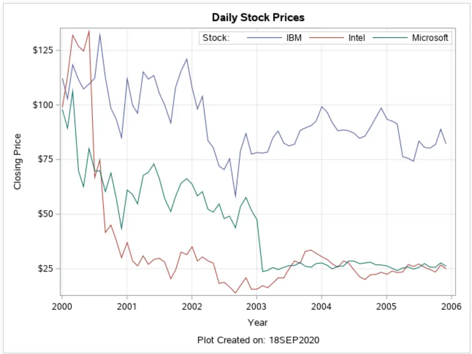
For far, we have only modified the labels of the X and Y-axis. However, with the xaxisopts and yaxisopts you can do a lot more. For example, you can use the timeopts option in combination with the interval option to define the tickmarks of the X-axis. By default, SAS plotted tickmarks every 6 months (see the plot above). However, you can change this with the interval option to, for example, one year.
You can also add the horizontal and vertical gridlines to make the plot more readable with the gridDisplay option. More information about all the options for the X and Y-axis can be found on the official SAS website.
/* Enhance X & Y-Axis */
proc template;
define statgraph timeseries_plot_template;
begingraph;
	entrytitle "Daily Stock Prices";
	layout overlay /
		xaxisopts=(label="Year"
			                timeopts=(interval=year)
			                griddisplay=on)
		yaxisopts=(label="Closing Price"
					griddisplay=on);

		seriesplot x=Date y=Close /
			name="timeseries_plot"
			group=Stock;

		discretelegend "timeseries_plot" /
			title="Stock: "
			location=inside
			valign=top
			halign=right
			opaque=true;
	endlayout;
	entryfootnote "Plot Created on: &SYSDATE9.";
endgraph;
end;
run;

proc sgrender data=sashelp.stocks (where=(year(date)>=2000))
	template=timeseries_plot_template;
run;
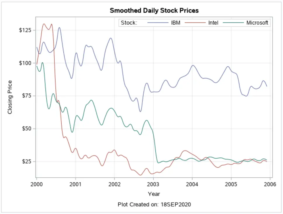
Create a Smoothed Time Series
Finally, we conclude this article with the splinetype option. With this option, you can smooth the time series and make them visually more appealing. By default, the Time Series aren’t smoothed, but if you set splinetype to quadraticbezier the series will be smoothed.
/* Smoothed Lines */
proc template;
define statgraph timeseries_plot_template;
begingraph;
	entrytitle "Smoothed Daily Stock Prices";
	layout overlay /
		xaxisopts=(label="Year"
					timeopts=(interval=year)
					griddisplay=on)
		yaxisopts=(label="Closing Price"
					griddisplay=on);

		seriesplot x=Date y=Close /
			name="timeseries_plot"
			group=Stock
			splinetype=quadraticbezier;

		discretelegend "timeseries_plot" /
			title="Stock: "
			location=inside
			valign=top
			halign=right
			opaque=true;
	endlayout;
	entryfootnote "Plot Created on: &SYSDATE9.";
endgraph;
end;
run;

proc sgrender data=sashelp.stocks (where=(year(date)>=2000))
	template=timeseries_plot_template;
run;
If you found this article interesting, you might like too our articles about how to create a Pie Chart or Scatter Plot. We also have an article where we explain how to create one page with multiple charts.
![5 Best Ways to Concatenate Strings in SAS [Examples]](https://sasexamplecode.com/wp-content/uploads/2020/12/THUMBNAIL_CONCATENATE-400x260.jpg)