This is the second article in a series on Data Visualisation in SAS. In this article, we discuss how to create a Scatter Plot in SAS. We show the basics of a Scatter Plot and explain how to add titles, enhance the X and Y-axis, add a legend, etc. In the end, you will be able to create a Scatter Plot just like the one above.
For the examples in this article, we use the famous Iris Flower data set that was introduced by Robert Fisher in 1936. The data set consists of 150 samples of the Patel Length, Patel Width, Sepal Length, and Sepal Width of three different Iris species (Setosa, Versicolor, and Virginica). You can find this data set in the SASHELP library.
Contents
Create a Basic Scatter Plot in SAS
Although you could use the SGPLOT procedure to create a Scatter Plot in SAS, we will use the TEMPLATE procedure. This procedure is slightly more complicated but is more versatile, i.e., you have more options to modify the graph to your needs.
With the TEMPLATE procedure, you define your graph, i.e., the type of your graph, the title, the legend, etc. Once you have completely defined the graph, you need the SGRENDER procedure to actually show the result.
In the SAS code below, we first let SAS know that we want to create a statistical graph (define statgraph) and give it a name for later reference (my_scatter_plot). Then, with the begingraph and endgraph statements and the layout overlay and endoverlay statements, we define a container for our graph. Finally, with the scatterplot statement, we let SAS know to create a Scatter Plot.
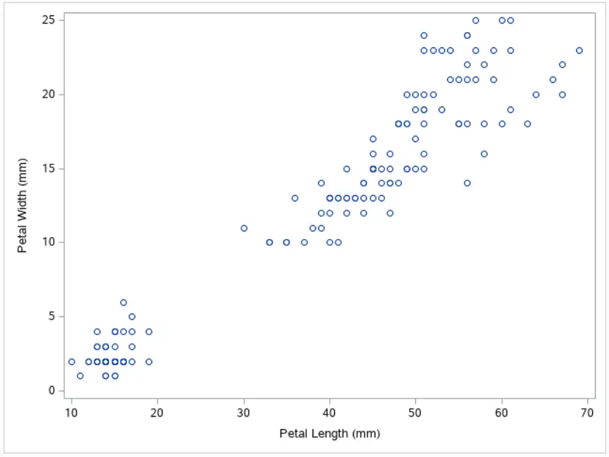
In this example, we create a Scatter Plot of the Petal Length and Petal Width of the Iris data.
proc template;
define statgraph my_scatter_plot;
	begingraph;
		layout overlay;
			scatterplot x=PetalLength y=PetalWidth;
		endlayout;
	endgraph;
end;
run;

proc sgrender data=sashelp.iris template=my_scatter_plot;
run;
Add Titles to a Scatter Plot
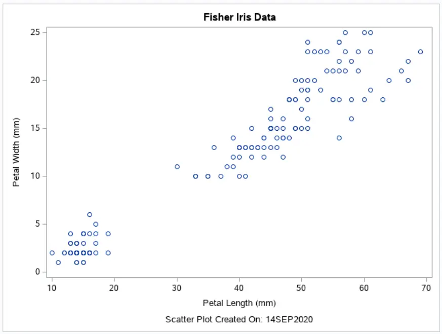
A good graph always has a title. You can use the entrytitle and entryfootnote statements to add a title and footnote to your graph. The code below shows where to place these statements.
proc template;
define statgraph my_scatter_plot;
	begingraph;
		entrytitle "Fisher Iris Data";
		layout overlay;
			scatterplot x=PetalLength y=PetalWidth;
		endlayout;
		entryfootnote "Scatter Plot Created On: &SYSDATE9.";
	endgraph;
end;
run;

proc sgrender data=sashelp.iris template=my_scatter_plot;
run;
Like with normal SAS titles, you can use macro variables in your title. In this case, we use the SYSDATE9. macro variable to show the date when the graph was created.
Do you know: How to Change the Size, Font, and Color of a Title in SAS?
Modify the X & Y-Axis
To create a nice graph, you need to pay attention to the X and Y-axis. With the xaxisopts and yaxisopts options, you can enhance the axes of your graph. Below we discuss the most common options. The options work the same for both axes.
First, to change the labels/titles of an axis, you can use the label option. You write your desired label between parentheses and quotation marks.
Next, with the linearopts and tickvaluelist you can specify the tickmarks of your axes. The elements of the list of tickmarks are separated by white space.
Finally, to create grid lines, you can use the gridDisplay option. By default, SAS doesn’t show grid lines. However, you can show the gridlines setting gridDisplay equal to Auto_On. You can use the gridlines option independently for the X and Y-axis.
proc template;
define statgraph my_scatter_plot;
	begingraph;
		entrytitle "Fisher Iris Data";
		layout overlay /
			xaxisopts = (label=("Iris Petal Length (in mm.)")
						linearopts=(tickvaluelist=(0 5 10 15 20 25 30 35 40 45 50 55 60 65))
						gridDisplay=Auto_On)
			yaxisopts = (label=("Iris Petal Width (in mm.)")
						linearopts=(tickvaluelist=(0.0 2.5 5.0 7.5 10.0 12.5 15.0 17.5 20.0 22.5 25.0))
						gridDisplay=Auto_On);
			scatterplot x=PetalLength y=PetalWidth;
		endlayout;
		entryfootnote "Scatter Plot Created On: &SYSDATE9.";
	endgraph;
end;
run;

proc sgrender data=sashelp.iris template=my_scatter_plot;
run;
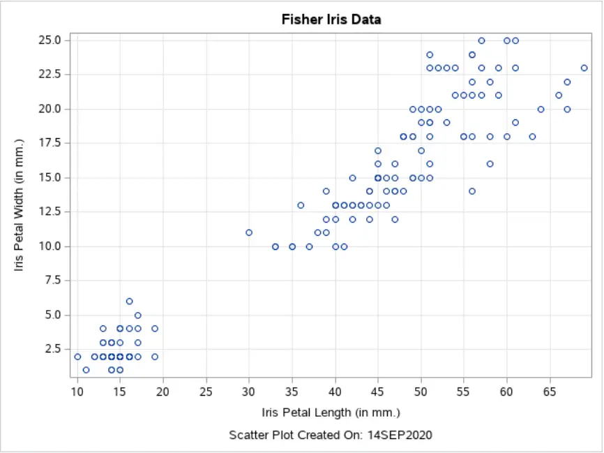
You can find a complete list of the axes options on the SAS website.
Create a Grouped Scatter Plot
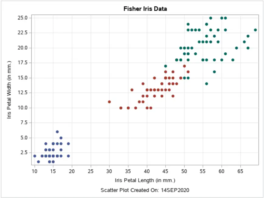
As mentioned before, the Iris Flower data set consists of samples of three species. We use the group option to separate the data into groups and give each group a different color in the Scatter Plot. With the markerattrs option, we can specify how the different groups are visualized (colors, shapes, etc.).
proc template;
define statgraph my_scatter_plot;
	begingraph;
		entrytitle "Fisher Iris Data";
		layout overlay /
			xaxisopts = (label=("Iris Petal Length (in mm.)")
						linearopts=(tickvaluelist=(0 5 10 15 20 25 30 35 40 45 50 55 60 65))
						gridDisplay=Auto_On)
			yaxisopts = (label=("Iris Petal Width (in mm.)")
						linearopts=(tickvaluelist=(0.0 2.5 5.0 7.5 10.0 12.5 15.0 17.5 20.0 22.5 25.0))
						gridDisplay=Auto_On);
			scatterplot x=PetalLength y=PetalWidth /
				group=Species markerattrs=(symbol=CircleFilled);
		endlayout;
		entryfootnote "Scatter Plot Created On: &SYSDATE9.";
	endgraph;
end;
run;

proc sgrender data=sashelp.iris template=my_scatter_plot;
run;
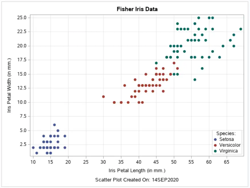
Add a Legend to a Scatter Plot
Now, we will explain how to add a legend to a Scatter Plot. Legends are essential for the interpretability of your graph.
With the discretelegend statement, you let SAS know you want to add a legend to the Scatter Plot. A legend is always linked to a graph. In this example, the legend is linked to the graph called “scatterplot” (see also the name option in the scatterplot statement).
You can give your legend a title with the title option. The location of the legend is defined by the halign and valign options. You can align your legend horizontally and vertically. With the location option, you specify where you want to show your legend, i.e., inside or outside of the graph.
Finally, you can define the opaqueness of the legend. By default, the legend is 100% transparent. However, you can change this setting by setting opaque to True. In our example, we don’t want to see the gridlines in the legend. So, we set opaque to True.
proc template;
define statgraph my_scatter_plot;
	begingraph;
		entrytitle "Fisher Iris Data";
		layout overlay /
			xaxisopts = (label=("Iris Petal Length (in mm.)")
						linearopts=(tickvaluelist=(0 5 10 15 20 25 30 35 40 45 50 55 60 65))
						gridDisplay=Auto_On)
			yaxisopts = (label=("Iris Petal Width (in mm.)")
						linearopts=(tickvaluelist=(0.0 2.5 5.0 7.5 10.0 12.5 15.0 17.5 20.0 22.5 25.0))
						gridDisplay=Auto_On);
			scatterplot x=PetalLength y=PetalWidth /
				name="scatterplot"
				group=Species markerattrs=(symbol=CircleFilled);
			discretelegend "scatterplot" /
				title="Species: "
				halign=right valign=bottom across=1 location=inside
				opaque=true;
		endlayout;
		entryfootnote "Scatter Plot Created On: &SYSDATE9.";
	endgraph;
end;
run;

proc sgrender data=sashelp.iris template=my_scatter_plot;
run;
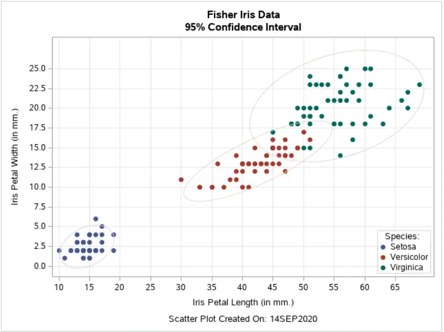
Add Confidence Intervals to a Scatter Plot
To conclude this article, we show how to add confidence intervals (ellipses) to a Scatter Plot. You need the ellipse statement and the x and y arguments to create a basic confidence interval. Then, to create a separate confidence interval for each group, you use the group option. With the alpha option, you can specify the certainty of the confidence interval. In this case, we use alpha=0.05 to create a 95% confidence interval. Finally, we use the name option, you could use this option to link the confidence interval and the legend.
proc template;
define statgraph my_scatter_plot;
	begingraph;
		entrytitle "Fisher Iris Data";
		entrytitle "95% Confidence Interval";
		layout overlay /
			xaxisopts = (label=("Iris Petal Length (in mm.)")
						linearopts=(tickvaluelist=(0 5 10 15 20 25 30 35 40 45 50 55 60 65))
						gridDisplay=Auto_On)
			yaxisopts = (label=("Iris Petal Width (in mm.)")
						linearopts=(tickvaluelist=(0.0 2.5 5.0 7.5 10.0 12.5 15.0 17.5 20.0 22.5 25.0))
						gridDisplay=Auto_On);
			scatterplot x=PetalLength y=PetalWidth /
				name="scatterplot"
				group=Species markerattrs=(symbol=CircleFilled);
			ellipse x=petallength y=petalwidth /
				group=species
	          	type=predicted alpha=0.05
	          	name="p95"
	          	outlineattrs=graphconfidence;
			discretelegend "scatterplot" /
				title="Species: "
				halign=right valign=bottom across=1 location=inside
				opaque=true;
		endlayout;
		entryfootnote "Scatter Plot Created On: &SYSDATE9.";
	endgraph;
end;
run;

proc sgrender data=sashelp.iris template=my_scatter_plot;
run;
In this series about Graphs and Charts in SAS, we also discuss:

One thought on “Learn How To Create Attractive Scatter Plots in SAS”
Comments are closed.