You can use a histogram to get an idea about the distribution of your data. A histogram counts the number of observations within a certain range and represents them with bins of different heights. In this article, we discuss 3 ways how to create a histogram in SAS.
You can create a histogram in SAS with the procedures: PROC SGPLOT, PROC UNIVARIATE, and PROC SGRENDER. The methods differ in flexibility and complexity.
For each method, we will show how to create a default histogram and how to modify the x- and y-axes, define the bins, and add a density curve.
Do you know? How to Create a Bar Chart
Contents
Sample Data
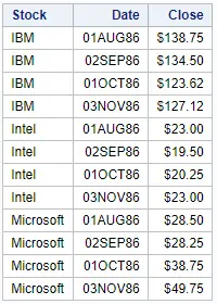
In this article, we use the STOCKS dataset from the SASHELP library. This dataset contains, amongst others, the stock price of three companies on different dates. We will create histograms to get a clue about the distribution of the closing price of the stocks.
1. Create a Histogram in SAS with PROC SGPLOT
The easiest and fastest way to create a histogram in SAS is with the PROC SGPLOT procedure.
You can use the SGPLOT procedure to create different types of plots, such as histograms, bar charts, or scatter plots. The procedure provides great flexibility when it comes to controlling the appearance of the plots. For example, you can define the labels of the axes, titles, legends, colors, etc.
This is how you create a histogram in SAS with PROC SGPLOT:
- Start the SGPLOT procedure with the PROC SGPLOT statement.
- Define your input dataset with the DATA=-option.
- Plot a histogram with the HISTOGRAM statement.
- Optionally, modify the appearance of the histogram with some optional arguments.
- Finish the SGPLOT procedure with the RUN statement.
How to Create a Standard Histogram?
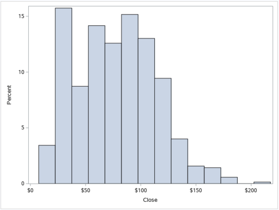
As discussed above, creating a standard histogram with the SGPLOT procedure is extremely easy. You only need to define your input dataset and specify the variable you want to plot.
With the SAS code below, we create a default histogram in just two steps. First, we use the SGPLOT statement and the DATA=-option to specify the input dataset. Then we use the HISTOGRAM statement to create the histogram. The HISTOGRAM statement consists of the histogram keyword followed by the name of the variable you want to visualize.
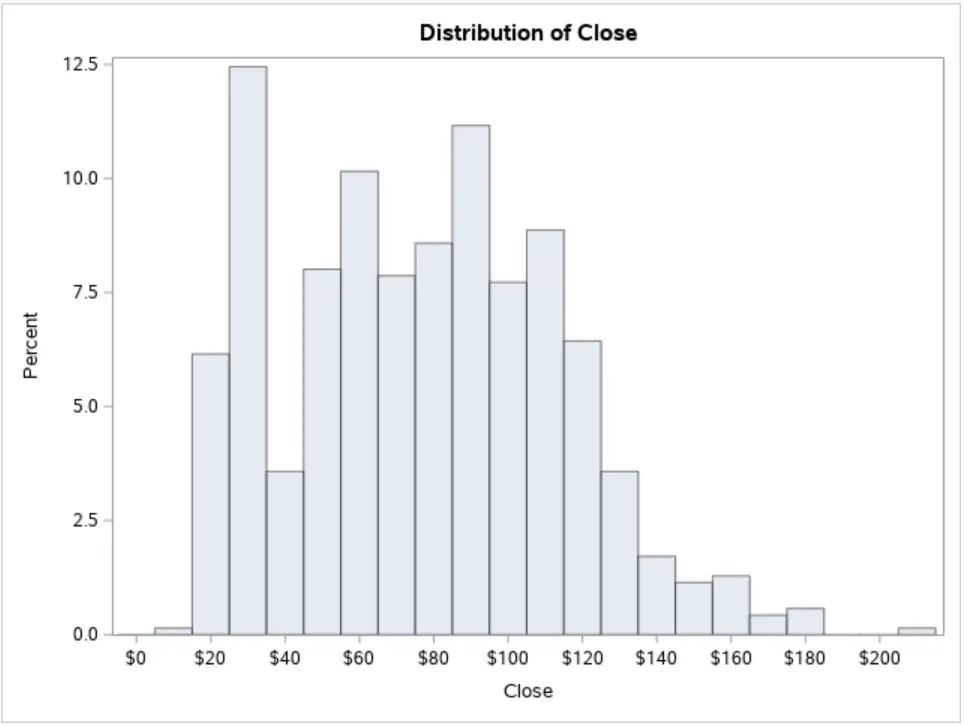
The example below displays the frequency distribution of the close variable from the STOCKS dataset.
proc sgplot data=sashelp.stocks;
    histogram close;
run;
How to Change the Y-Axis from Percentage to Frequency?
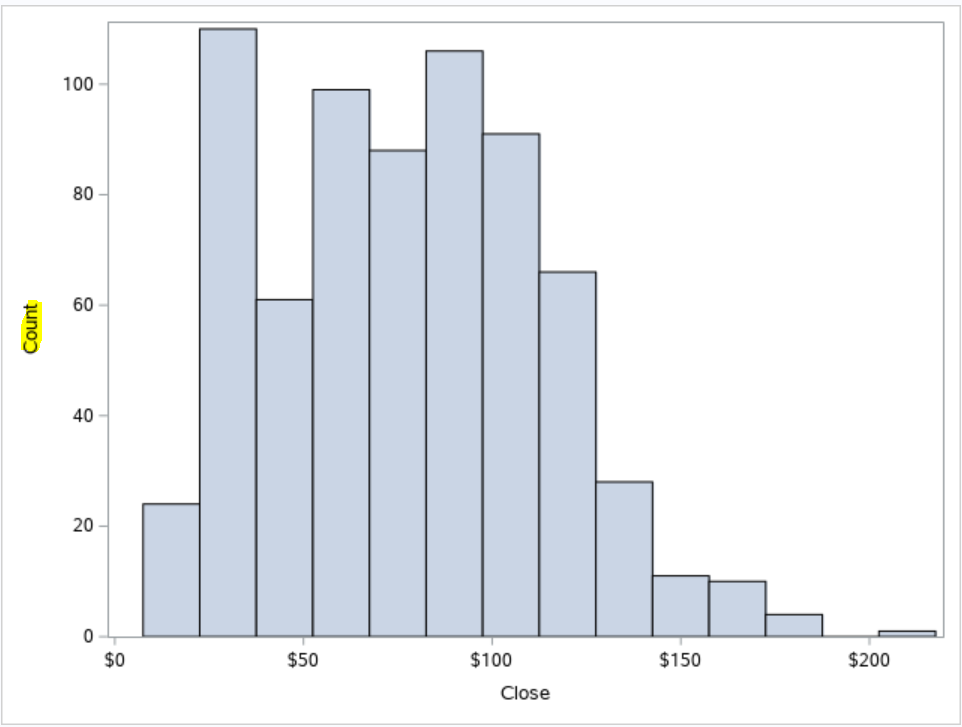
In a standard histogram, the height of each bin represents the percentage of observations it contains compared to all observations. However, you might be more interested in the number of observations in each bin (i.e., the frequency) So, how do you change the scale of the Y-axis from percentage to frequency?
You change the scale of the Y-axis of a histogram with the SCALE=-option. Set the value of this option to COUNT, and the histogram will display frequencies instead of percentages. The SCALE=-option is part of the HISTOGRAM statement.
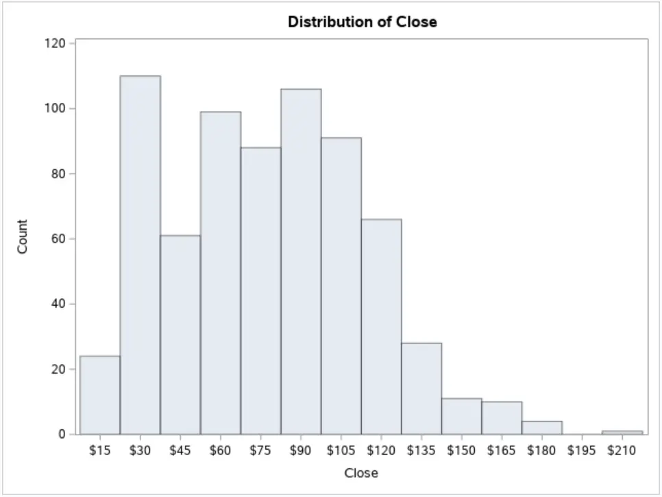
In the example below, we use the SCALE=-option to show the frequency of the variable close.
proc sgplot data=sashelp.stocks;
    histogram close / scale=count;
run;
Do you know? How to Create Frequency Tables
How to Change the X-Axis Label?
As you know, a variable in a SAS dataset must have a name and might have a label. When you create a histogram with PROC SGPLOT, the label of the X-axis is equal to the label of the variable you plot. If your variable has no label, then PROC SGPLOT will show the variable name as the label.
But, how do you change the X-axis label in a histogram?
You change the label of the X-axis in a SAS histogram with the XAXIS statement. With the LABEL=-option, you can specify the label of the X-axis. You can use the XAXIS statement also to control other features such as gridlines and tickmarks.
Alternatively, you could change the variable label in the dataset before you create the histogram.
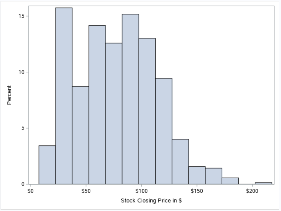
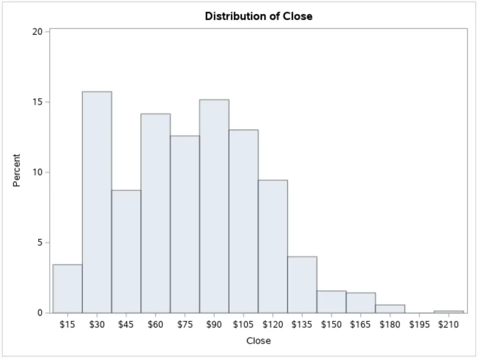
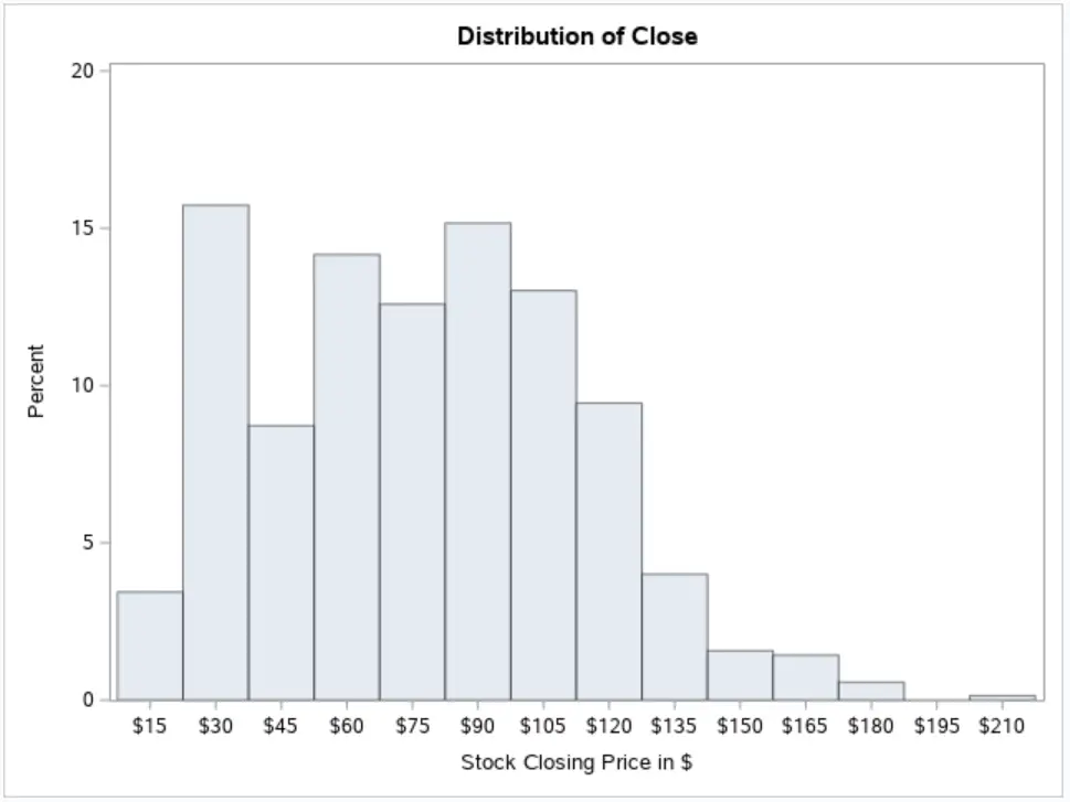
In the example below, we use the XAXIS statement and the LABEL=-option to set the X-axis label to “Stock Closing Price in $“.
proc sgplot data=sashelp.stocks;
    histogram close;
    xaxis label="Stock Closing Price in $";
run;
Likewise, you can use the YAXIS statement in combination with the LABEL=-option to change the modify the label of the Y-axis in a histogram. By default, the label of the Y-axis is Count or Percentage.
Do you know: How to Create a Title in SAS?
How to Change the Bin Size and Number of Bins?
By default, the SGPLOT procedure guesses the bin size and number of bins that would be the best option to display the frequency of distribution of your data. This works 95% of the time, but not always. So, how do you change the bin size and number of bins in a SAS histogram?
You change the bins with the optional arguments of the HISTOGRAM statement. We recommend using the following options
- binstart: Specifies the midpoint of the first bin.
- binwidth: Specifies the width of each bin. SAS ignores this option if you also use the nbins option.
- nbins: Specifies the number of bins.
- showbins: Specifies that the midpoint of the bins are used as tick marks.
Note that a histogram has at most 10.000 bins. If you use a combination of options that causes the number of bins to be greater than 10.000, SAS writes a warning to the log and use the default bins.
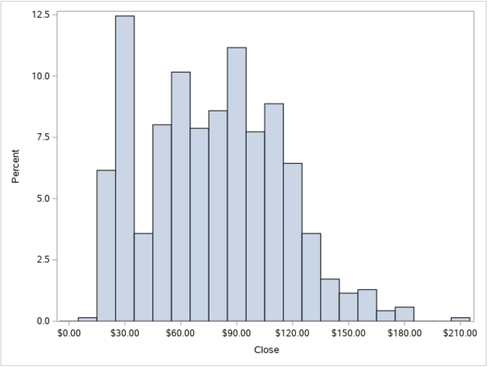
With the SAS code below we specify the bins of our histogram with the binstart, binwidth, and showbins options.
proc sgplot data=sashelp.stocks;
    histogram close / binstart=0 binwidth=10 showbins;
run;
How to Add a Density Curve to a Histogram
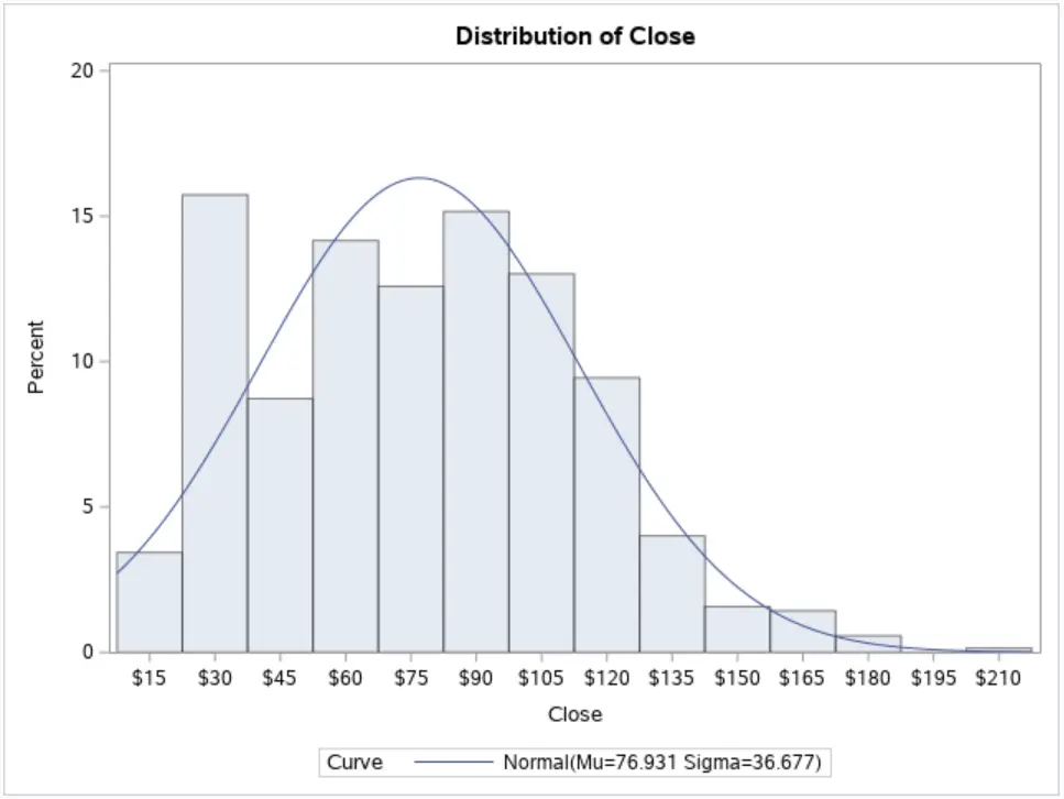
In general, you create a histogram to get an idea about the distribution of your data. For example, to check if your data might be normally distributed. So, how do you add the curve of a normal distribution to a histogram in SAS?
You use the DENSITY statement to add a density curve to a histogram. With the TYPE=-option, you specify that SAS must add a normal distribution curve. Additionally, you can use the MU=-option and the SIGMA=-option to specify the parameters of the normal curve.
The DENSITY statement starts with the density keyword and the variable you want to plot. After a forward slash, you can specify optional arguments to control the density function.
If you add a normal density curve to your histogram, SAS bases the mu and sigma of the curve on the sample mean and sample standard deviation. You can modify these parameters with the MU=-option and SIGMA=-option.
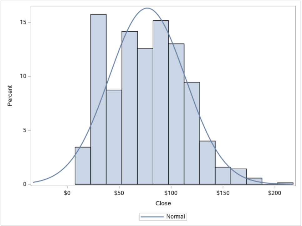
In the example below, we overlay our histogram with a normal density curve.
proc sgplot data=sashelp.stocks;
    histogram close;
    density close / type=normal;
run;
Instead of the density curve of the normal distribution, you can also use the DENSITY statement to overlay your histogram with a nonparametric kernel density estimate. In this case, you need to set the TYPE=-option to KERNEL.
How to Create a Histogram by Group?
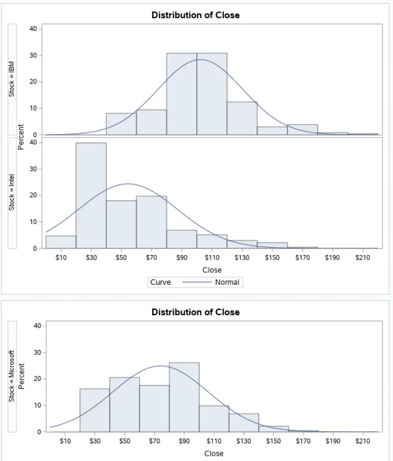
If your data can be separated into groups, you might want to create a histogram with different groups. So, how do you create a histogram by group in SAS?
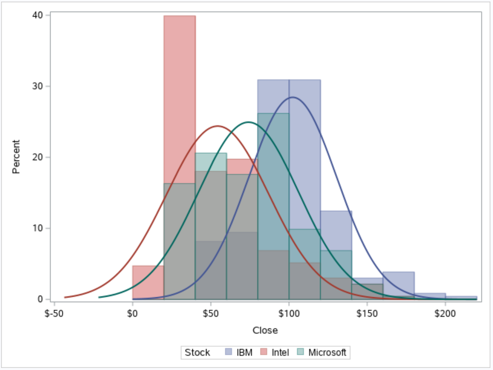
You use the GROUP=-option to create one plot with histograms by group. The GROUP=-option is an optional argument of the HISTOGRAM statement. Each group has a different color.
You can use the GROUP=-options also in the DENSITY statement.
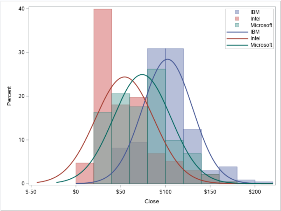
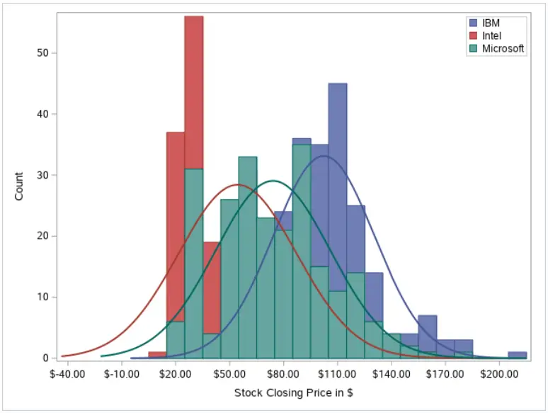
With the SAS code below, we create a histogram for the closing price of each stock (IBM, Intel, Microsoft). Note that we use the GROUP=-option in both the HISTOGRAM statement and the DENSITY statement.
proc sgplot data=sashelp.stocks;
    histogram close / group=stock transparency=0.5;
    density close / group=stock type=normal;
run;
If you use the GROUP=-option, SAS creates a histogram for each group and displays them all in one plot. However, if you want to display only the histogram of one group (e.g., only Microsoft), you need to filter your data first. You can do this with the WHERE statement or the WHERE=-option.
How to Add a Legend to a Histogram?
All good plots have a legend, but how do you add a legend to a histogram in SAS?
You use the KEYLEGEND statement to add a legend to a SAS histogram. You can use the LOCATION=-option to specify the location of the legend. Also, with the POSITION=-option, you can define its position.
In the example below, we add a legend to our histogram. We use the KEYLEGEND statement and optional arguments LOCATION= and POSITION= to create a legend within the plot at the top right corner.
proc sgplot data=sashelp.stocks;
    histogram close / group=stock transparency=0.5;
    density close / group=stock type=normal;
    keylegend / location=inside position=topright across=1;
run;
Do you know? How to Create Other Beautiful Plots in SAS
2. Create a Histogram in SAS with PROC UNIVARIATE
The second method to create a histogram in SAS is with the PROC UNIVARIATE procedure.
PROC UNIVARIATE is a powerful SAS Base procedure that you can use to assess the distribution of your data, including a test for normality. By default, this procedure creates only a report with summary statistics, but you can also use it to create a histogram.
This is how you create a histogram in SAS with PROC UNIVARIATE:
- Start the UNIVARIATE procedure with the PROC UNIVARIATE statement.
- Define your input dataset with the DATA=-option.
- Specify the name of the variable you want to plot with the VAR statement.
- Use the HISTOGRAM statement to create the histogram.
- Optionally, modify the appearance of the histogram with some optional arguments.
- Finish the UNIVARIATE procedure with the RUN statement.
How to Create a Default Histogram with PROC UNIVARIATE?
As mentioned above, creating a histogram in SAS with PROC UNIVARIATE is straightforward.
Firstly, you define the input dataset with the DATA=-option. Then, with the VAR statement, you specify the variable you want to plot. Finally, you use the HISTOGRAM statement to display the histogram.
In the example below, we create a histogram of the close variable from the STOCKS dataset.
proc univariate data=sashelp.stocks;
    var close;
    histogram;
run;
If you run the code above, you’ll notice that the PROC UNIVARIATE procedure also generates a report with many statistics. If you’re only interested in the histogram, you can add the NOPRINT option after the DATA=-option. This option suppresses the report with statistics.
How to Change the Y-Axis from Percentage to Count?
By default, the PROC UNIVARIATE procedure generates a histogram with percentages on the Y-axis. However, sometimes it’s more useful to show frequencies instead. So, how do you change the scale of the Y-axis from percentage to count?
You use the VSCALE=-option from the HISTOGRAM statement to change the Y-axis of a histogram in SAS. By default, this option’s value is PERCENT. However, if you set this option to COUNT, then the histogram will show the frequencies on the Y-axis.
The example below shows how to change the scale of the Y-axis.
proc univariate data=sashelp.stocks;
    var close;
    histogram / vscale=count;
run;
How to Change the X-Axis Label?
Good plots always have descriptive labels. However, the default labels of the histogram might not always be good enough to convey your message. So, how do you change the label of the X-axis of a histogram?
You change the label of the X-axis of a histogram in PROC UNIVARIATE with the LABEL statement. The LABEL statement starts with the LABEL keyword, followed by the variable you plot, an equal sign, and the new label between double-quotes.
Alternatively, you could change the label of the variable in the original dataset (before you use the PROC UNIVARIATE procedure).
In the example below, we change the label of the close variable to “Stock Closing Price in $“.
proc univariate data=sashelp.stocks;
    var close;
    histogram;
    label close = "Stock Closing Price in $";
run;
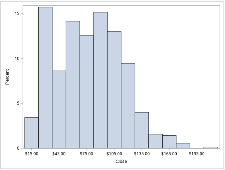
How to Define the Number of Bins and the Bin Size?
An important aspect of your histogram is the number of bins and the bin size. By choosing the right number and size of the bins, the distribution of your data can be visualized better. But, how do you change the number of bins and the bin size?
You define the number of bins and the bin size with the MIDPOINTS=-option. You can provide a list with the midpoints of each bin or specify a range. This is an option of the HISTOGRAM statement.
The most robust way to define the number of bins and the bin size is by specifying a range of midpoints. Firstly, you specify the midpoints of the first and last bin. Then, you define the width of each bin.
In the example below, we demonstrate how to use the MIDPOINTS=-option. The midpoints of our bins range from 0 to 210, with a step size of 10 (i.e, bin width).
proc univariate data=sashelp.stocks;
    var close;
    histogram / midpoints=0 to 210 by 10;
run;
How to Fit a Distribution Curve to a Histogram?
Normally, you use a histogram to assess the distribution of your data. So, it’s useful to compare the distribution of your data to a theoretical distribution. But, how do you add a distribution curve to a histogram in PROC UNIVARIATE?
You add a normal distribution curve to a histogram with the NORMAL option. This option is part of the HISTOGRAM statement. You can also fit other density curves such as a Beta distribution or Log-Normal distribution. You can set the parameters of each distribution with additional options.
In the example below, we use the HISTOGRAM statement to fit a normal distribution to our data. First, we specify the HISTOGRAM keyword, followed by a forward-slash, and the NORMAL keyword.
By default, SAS estimates the mean and standard deviation of the normal distribution. However, you can specify these parameters explicitly by using the MU=-option and the SIGMA=-option.
proc univariate data=sashelp.stocks;
    var close;
    histogram / normal;
run;
See here a complete list of distribution you can fit to a histogram with PROC UNIVARIATE.
How to Create a Histogram by Group?
Finally, we discuss how to create a histogram by group.
There are two ways to create a histogram per group with PROC UNIVARIATE. You can use the CLASS statement if you want to show the histograms in one image. However, if you want to plot the histograms separately, you need the BY statement. In both cases, the statement is followed by the variable that defines the groups.
In contrast to the PROC SGPLOT procedure, it isn’t possible to create more than one histogram within the same plot.
Below, we use the CLASS statement to create a histogram per type of stock (IBM, Intel, and Microsoft).
proc univariate data=sashelp.stocks;
    var close;
    class stock;
    histogram / normal;
run;
Do you know? How to Create a Pie chart
3. Create a Histogram in SAS with PROC SGRENDER
The third method to create a histogram in SAS is with PROC TEMPLATE and PROC SGRENDER. This method is the most complex method of the 3 we discuss. However, it provides great flexibility.
The idea is to create first a template of your plot and then render the plot. In fact, the PROC SGPLOT procedure uses this technique.
How to Create a Standard Histogram with PROC SGRENDER?
This is how to create a histogram in SAS with PROC SGRENDER:
- Create a template with the PROC TEMPLATE procedure.
- Specify the name of your template with the DEFINE STATGRAPH statement.
- Start the plot with the BEGINGRAPH statement.
- Use the LAYOUT statement to define the layout area.
- Use the HISTOGRAM statement to display a histogram.
Once you’ve created the template, you can use the PROC SGRENDER procedure to generate the histogram. You do this by defining the input dataset with the DATA=-option and the TEMPLATE=-option.
In the example below, we use PROC TEMPLATE and PROC SGRENDER to create a histogram of the close variable.
proc template;
define statgraph my_histogram;
    begingraph;
        layout overlay;
	histogram close;
	endlayout;
    endgraph;
end;
run;

proc sgrender data=sashelp.stocks
    template=my_histogram;
run;
How to Create an Advanced Histogram with PROC SGRENDER?
As mentioned before, this method provide great flexibility. However, the code becomes more complex. With the code below, we create a more advanced histogram with PROC TEMPLATE and PROC SGRENDER.
proc template;
define statgraph my_histogram_template;
    begingraph;
        layout overlay;
            histogram close / group=stock scale=count binstart=0 binwidth=10 name="my_histogram";
            densityplot close / group=stock normal();
            discretelegend "my_histogram" / location=inside halign=right valign=top across=1;
	endlayout;
    endgraph;
end;
run;

proc sgrender data=sashelp.stocks
    template=my_histogram_template;
    label close = "Stock Closing Price in $";
run;
Do you know? How to Create a Plot with Multiple Graph Types

2 thoughts on “3 Easy Ways to Create a Histogram in SAS”
Comments are closed.