In this article, we explain how to create a Bar Chart in SAS with the SGPLOT procedure.
A bar chart presents categorical data with rectangular bars where the height of the bars is proportional to the value they represent. Bar charts are useful to compare metric values across different (sub)groups of your data. So, how do you create a bar chart in SAS?
The easiest way to create a bar chart in SAS is with the SGPLOT procedure. For a basic bar chart, you need to define two parameters. Firstly, with the DATA=-option, you specify the name of your dataset. Then, with the VBAR statement, you state the variable you want to plot.
Before we show how to create different bar charts with SGPLOT, we need to clarify the difference between a bar chart and a histogram. A bar chart compares discrete variables, whereas a histogram represents the frequency distribution of a continuous variable.
Do you know? How to Create a Histogram in SAS
Contents
How to Create a Bar Chart in SAS
Broadly speaking, there exist two types of bar charts, namely vertical bar charts (i.e., column charts) and horizontal bar charts. The height (vertical bar chart) or width (horizontal bar chart) is proportional to the value each group represents. If your data has subgroups, then you need grouped or stacked bar charts.
In this section, we use the CARS dataset to demonstrate how to create a:
- Vertical Bar Chart
- Vertical Grouped Bar Chart
- Vertical Stacked Bar Chart
- Horizontal Bar Chart
- Horizontal Grouped Bar Chart
- Horizontal Stacked Bar Chart
The CARS dataset is a freely available dataset from the SASHELP library. It contains characteristics of 428 different cars from 2004. For example, the make, model, and type.
Create a Bar Chart
The most common type of bar chart is the Vertical Bar Chart. It presents categorical data with vertical bars. The size of the bars is proportional to the value it represents. So, how do you create a vertical bar chart in SAS?
You create a vertical bar chart in SAS with the SGPLOT procedure. This procedure requires you to define two parameters:
- The DATA=-option
With the DATA=-option, you define the name of the input dataset. You can use additional dataset options to, for example, filter your data.
- The VBAR Statement
With the VBAR statement, you specify that you want to create a vertical bar chart. After the VBAR keyword, you indicate the name of the variable you want to plot.
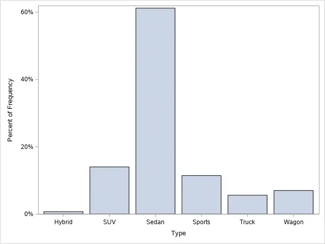
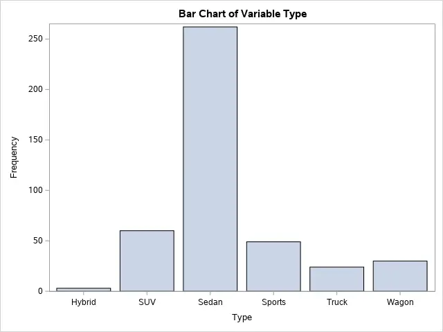
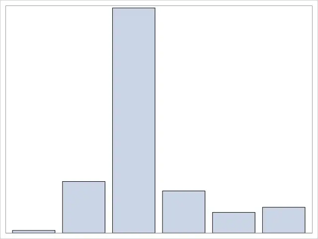
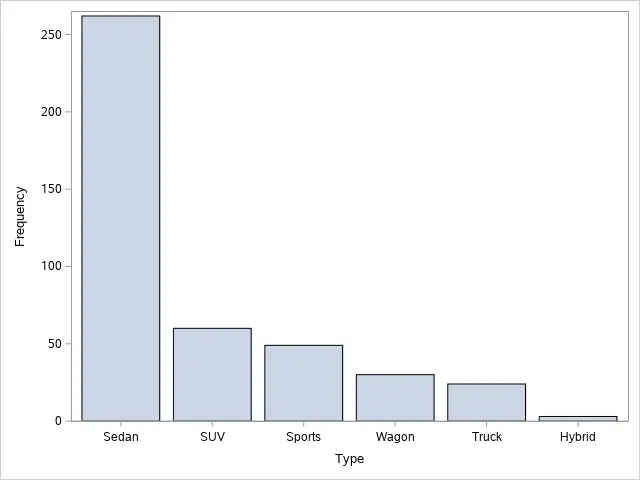
In the example below, we create a bar chart of the Type variable from the CARS dataset.
/* Bar Chart */
proc sgplot data=sashelp.cars;
    vbar type;
run;
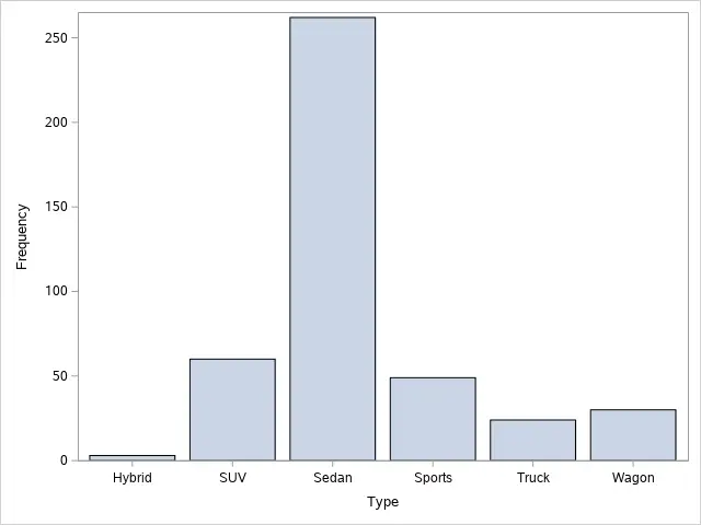
As the image above demonstrates, a default bar chart in SAS shows the frequency of each category. Instead, if you want to show the percentage that each category represents, you can use the STAT=-option.
Also, by default, SAS orders the categories on the X-axis in alphabetical order. If you need to change this order, for example, from highest frequency to lowest frequency, you need to specify the CATEGORYORDER=-option.
Create a Grouped Bar Chart
A second common type of bar chart is the grouped bar chart (or clustered bar chart, or multi-series bar chart). A grouped bar chart plots numeric values of two categorical variables instead of one. But, how do you create a grouped bar chart in SAS?
In SAS, you create a grouped bar chart with the SGPLOT procedure. You need to define four parameters:
- DATA=-option. With the DATA=-option, you specify the name of the input dataset.
- VBAR statement. The VBAR statement creates a vertical bar chart that summarizes the values of a categorical variable. The VBAR statement starts with the VBAR keyword, followed by the name of the variable you want to plot. To create a grouped bar chart, you need to specify two additional options.
- GROUP=-option. With the GROUP=-option, you specify the variable that defines the subgroups in your data.
- GROUPDISPLAY-=option. With the GROUPDISPLAY=-option, you define the appearance of the groups. If you set this option to CLUSTER, SAS will create a grouped bar chart.
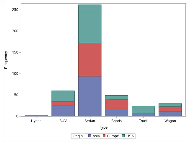
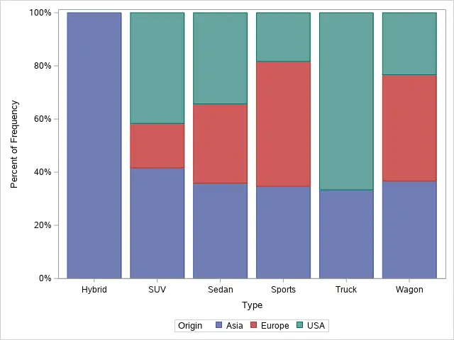
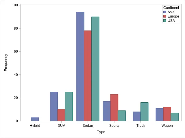
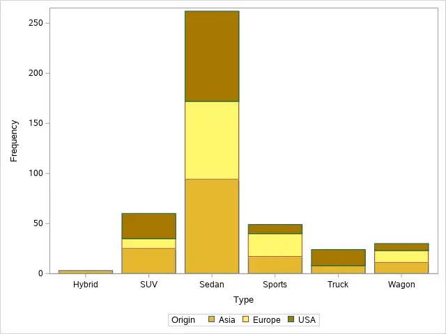
In the example below, we create a grouped bar chart of the Type and Origin variables from the CARS dataset.
proc sgplot data=sashelp.cars;
    vbar type / group=origin groupdisplay=cluster;
run;
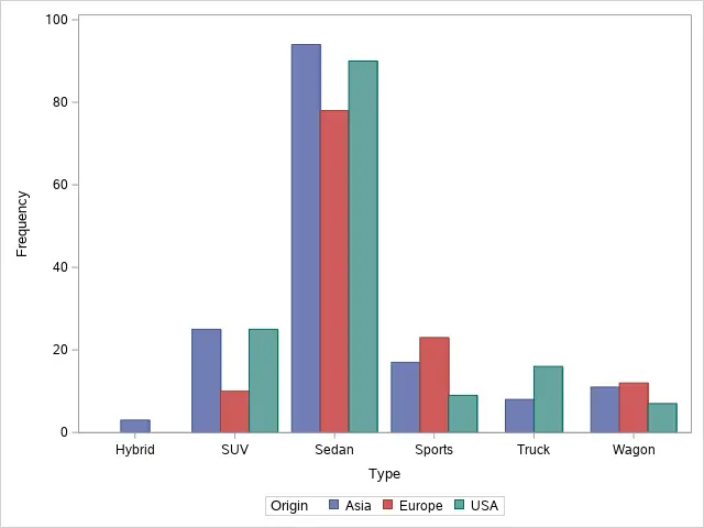
As the image above demonstrates, a standard grouped bar chart in SAS contains a legend at the bottom, outside of the chart. There exist different options to change the appearance and location of the legend.
Also, the colors of the groups are by default blue, red, and green. If you want to change the colors, you need the STYLEATTRS statement.
Create a Stacked Bar Chart
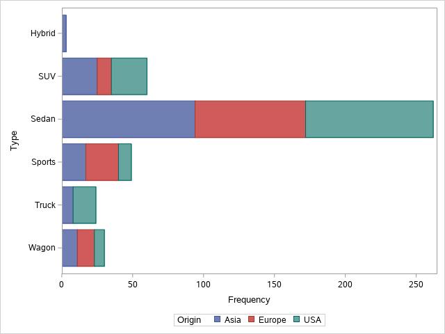
The third type of horizontal bar chart is the stacked bar chart. This type of chart is similar to the grouped bar chart, but this time there is just one bar per category, and the groups are stacked. But, how do you create a stacked bar chart in SAS?
You create a stacked bar chart in SAS with the SGPLOT procedure. All parameters are the same as for a grouped bar chart, except for the GROUPDISPLAY=-option. To create a stacked bar chart, you need to set the GROUPDISPLAY=-option to STACK.
You can use the SAS code snippet below to create a stacked bar chart of the Type and Origin variables from the CARS dataset.
proc sgplot data=sashelp.cars;
    vbar type / group=origin groupdisplay=stack;
run;
Create a Horizontal Bar Chart
Besides vertical bar charts, you can also use the PROC SGPLOT procedure to create horizontal bar charts in SAS.
You create a horizontal bar chart in SAS by defining the input dataset using the DATA=-option and the HBAR statement. The HBAR statement starts with the HBAR keyword, followed by the name of the variable you want to plot. Additionally, you can add options to the HBAR statement to change the appearance of the bar chart.
With the SAS code below, we create a standard horizontal bar chart of the Type variable from the CARS dataset.
/* Horizontal Bar Chart */
proc sgplot data=sashelp.cars;
    hbar type;
run;
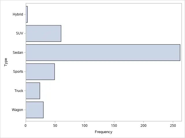
As the image above demonstrates, a horizontal bar chart shows each category’s frequency in alphabetical order. You can change the frequency to percentage with the STAT=-option, whereas with the CATEGORYORDER=-option, you can change the order of bars’ appearance.
Create a Grouped Horizontal Bar Chart
Like a vertical grouped bar chart, you can also create horizontal grouped bar charts is SAS.
You create a horizontal grouped bar chart in SAS with the SGPLOT procedure. The procedure starts with the PROC SGPLOT statement, followed by the DATA=-option to define the input dataset. Then, with the HBAR statement, you specify the variable to plot. Finally, with the GROUP=-option and the GROUPDISPLAY=-option, you create a grouped bar chart.
More specifically, you use the GROUP=-option to specify the second categorical variable that defines the subgroups. You write the name of this variable without (double) quotes.
The GROUPDISPLAY=-option defines the appearance of the bar chart. You need to set this option to CLUSTER to create a grouped bar chart.
In the example below, we create a horizontal grouped bar chart.
/* Horizontal Grouped Bar Chart */
proc sgplot data=sashelp.cars;
    hbar type / group=origin groupdisplay=cluster;
run;
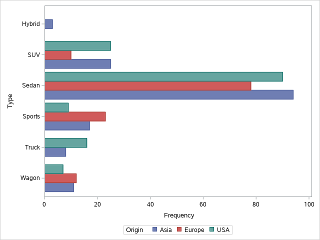
By default, bar charts in SAS plot the frequency of each category. If necessary, you can show the percentage or add a response variable.
Create a Stacked Horizontal Bar Chart
A horizontal stacked bar chart is another way to present your data.
In SAS, you can use the SGPLOT procedure to create a horizontal stacked bar chart. The syntax is almost identical to the horizontal grouped bar chart. You only need to change the value of the GROUPDISPLAY=-option. If you set this option to STACK, SAS will generate a horizontal stacked bar chart.
In the example below, we create a horizontal stacked bar chart of the Type and Origin variables from the CARS dataset.
/* Horizontal Stacked Bar Chart */
proc sgplot data=sashelp.cars;
    hbar type / group=origin groupdisplay=stack;
run;
How to Change the Y-Axis of a Bar Chart in SAS
By default, bar charts in SAS show the frequency of each category. However, sometimes it is necessary to show the percentage that the frequency represents, or add a response variable to your plot. In this section, we will discuss how to do this.
Bar Chart with Percentage of Frequency
A standard SAS bar chart shows the frequency of each category. This might be necessary, but on some occasions, a percentage might be more useful. So, how do you create a bar chart with percentages in SAS?
You create a bar chart with percentages with the SGPLOT procedure and the STAT=-option. By default, this option has the value FREQ, but if you change its value to PCT, SAS creates a bar chart with percentages.
So, you only need to change the value of the STAT=-option to generate a bar chart with percentages. In other words, all other code remains unchanged.
Note that, you can use the STAT=-option in all type of bar charts (i.e., vertical and horizontal, as well as grouped and stacked).
In the example below, we use the STAT=-option to plot the percentage of frequency on the Y-axis. We do this both for a standard bar chart, as well as for a stacked bar chart.
proc sgplot data=sashelp.cars;
    vbar type / stat=pct;
run;
proc sgplot data=sashelp.cars;
    vbar type / group=origin groupdisplay=stack stat=pct;
run;

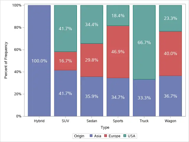
Segmented Bar Chart
A special type of a stacked bar chart is the segmented bar chart.
The bars in a segmented bar chart sum all up to 100%. This makes this type of char ideal to compare the percentages of frequency of subgroups between groups.
So, how do you create a segmented bar chart in SAS?
You create a segmented bar chart in SAS with the SGPLOT procedure. The syntax is almost identical to a stacked bar chart. However, you need to add the PCTLEVEL=-option to the SGPLOT statement. If you set the PCTLEVEL=-option to GROUP, SAS generates a segmented bar chart.
In the example below, we create a segmented bar chart.
proc sgplot data=sashelp.cars pctlevel=group;
    vbar type / group=origin groupdisplay=stack stat=pct;
run;
As mentioned before, a segmented bar chart is great to compare the percentages of subgroups. For example, to compare the percentages of models from Europe between the different vehicle types. To make the comparison even easier, you can add labels to each bar.
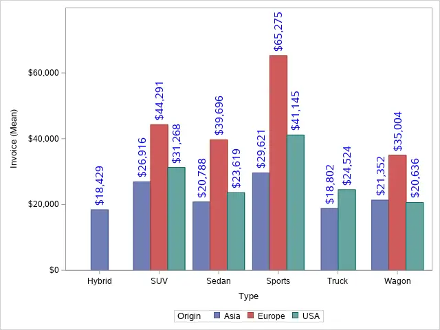
Bar Chart with Response Variable Statistic
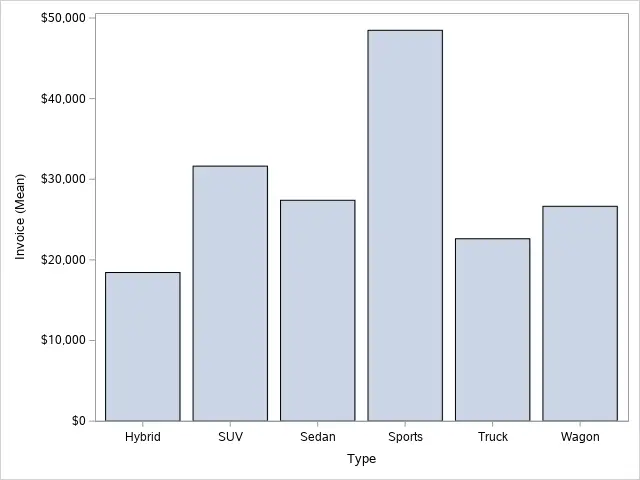
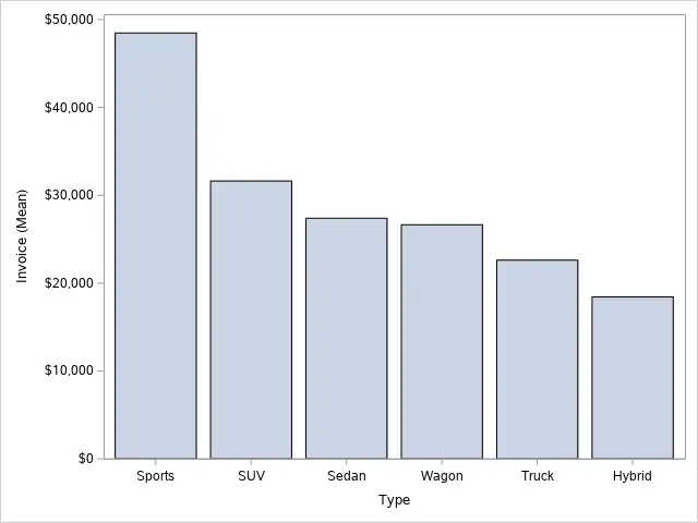
Until now, we have demonstrated how to create different types of bar charts, and how to show percentages instead of frequencies. In this section, we discuss how to add a response variable to a bar chart. That is to say, we add a dependent variable to the Y-axis. For example, the average of the Invoice variable.
In SAS, you can add a response variable to a bar chart with the SGPLOT procedure and the RESPONSE=-option. With the RESPONSE=-option, you define which variable you want to plot on the Y-axis. Then, with the STAT=-option, you can specify what statistic to show. For example, the sum or the mean.
You can use the REPONSE=-option with all types of bar charts as long as the response variable is numeric. As values for the STAT=-option, you can use mean, median, and sum.
The SAS code below show how to create a bar chart with the average of the Invoice variable of the Y-axis.
proc sgplot data=sashelp.cars;
    vbar type / response=invoice stat=mean;
run;
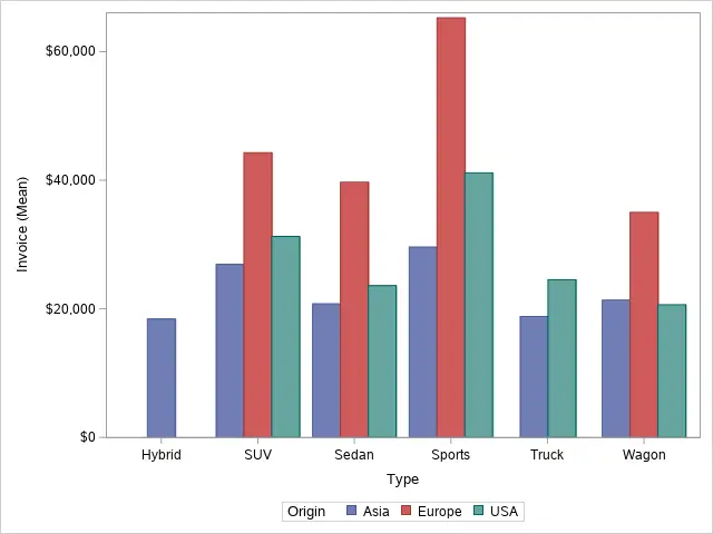
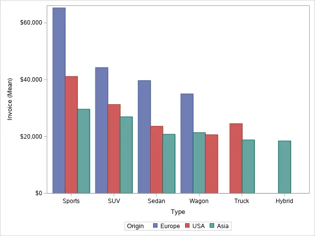
Below we show how to create a grouped bar chart with a response variable.
proc sgplot data=sashelp.cars;
    vbar type / group=origin groupdisplay=cluster response=invoice stat=mean;
run;
How to Change the Title of a Bar Chart
By default, the SGPLOT procedure does not generate a title. However, good graphics always have descriptive titles. So, how do you add a title to a bar chart in SAS?
You add a title to a bar chart in SAS with the TITLE statement. The TITLE statement starts with the TITLE keyword, followed by the title between (double) quotes. You finish the TITLE statement with a semicolon.
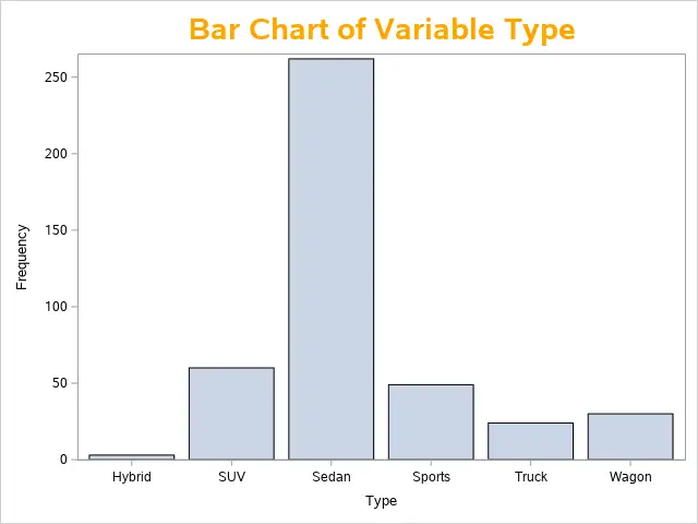
In the example below, we demonstrate how to add a title to a bar chart.
title "Bar Chart of Variable Type";
proc sgplot data=sashelp.cars;
    vbar type;
run;
title;
By default, the titles of a bar chart have a height of 12 points and are black. You can use the HEIGHT=-option and the COLOR=-option to change the appearance of your title.
title height=20pt color=orange "Bar Chart of Variable Type";
proc sgplot data=sashelp.cars;
    vbar type;
run;
title;
Do you know: How to Change the Size, Font, and Position of a Title in SAS?
How to Change the Axis Labels of a Bar Chart
Another important aspect of charts are the labels of the X-axis and Y-axis.
By default, the X-axis and Y-axis of a bar chart contain the variable labels or variable names (if no label has been specified). This might fit your purpose, but sometimes it is not what you want. So, how do you change the labels of the X-axis and Y-axis of a bar chart in SAS?
You change the label of the X-axis and Y-axis with the XAXIS and YAXIS statements. For example, you can use these statements to change the labels, remove the labels, or show no axis at all.
In this section, we will show how to do this.
Show Axis Labels
The most common question regarding label axis is how to change them.
You can change the label of the X-axis of a bar chart with the XAXIS statement. The statement starts with the XAXIS keyword, followed by the LABEL=-option. After the LABEL=-option, you write the new label between (double) quotes. The statement ends with a semicolon.
You can follow the same procedure to change the label of the Y-axis. However, instead of the XAXIS keyword, you use the YAXIS keyword.
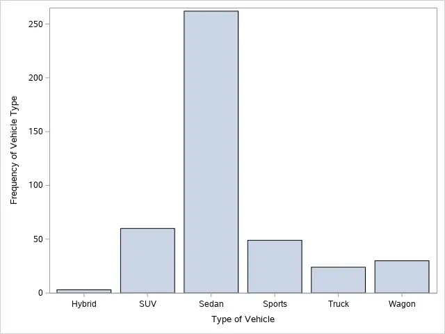
In the example below, we change the labels of the X-axis and Y-axis.
/* X-Axis & Y-Axis Title */
proc sgplot data=sashelp.cars;
    vbar type;
    xaxis label="Type of Vehicle";
    yaxis label="Frequency of Vehicle Type";
run;
Remove a Axis Label
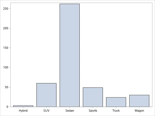
Sometimes it is not necessary to show the label of your axis. So, how do you remove the label of an axis in SAS?
You remove the label from the X-axis in a bar chart in SAS with the XAXIS statement. The statement starts with the XAXIS keyword, followed by the DISPLAY=-option. By setting the value of the DISPLAY=-option to (NOLABEL), SAS removes the label of the X-axis.
Similarly to the instructions above, you can remove the label of the Y-axis. You only need to use the YAXIS keyword instead of the XAXIS keyword.
Below we show how to remove both the label of the X-axis and the Y-axis.
proc sgplot data=sashelp.cars;
    vbar type;
    xaxis display=(nolabel);
    yaxis display=(nolabel);
run;
Remove a Axis
Besides the labels of the X-axis and Y-axis, a default bar chart also contains the categories on the X-axis and the value markers on the Y-axis.
You can remove the categories or the tick marks with the DISPLAY=-option. If you set this option to NONE, SAS will remove all labels and categories / tick marks from the axes.
With the SAS code below you can remove the X-axis and Y-axis from a bar chart in SAS.
proc sgplot data=sashelp.cars;
    vbar type;
    yaxis display=none;
    xaxis display=none;
run;
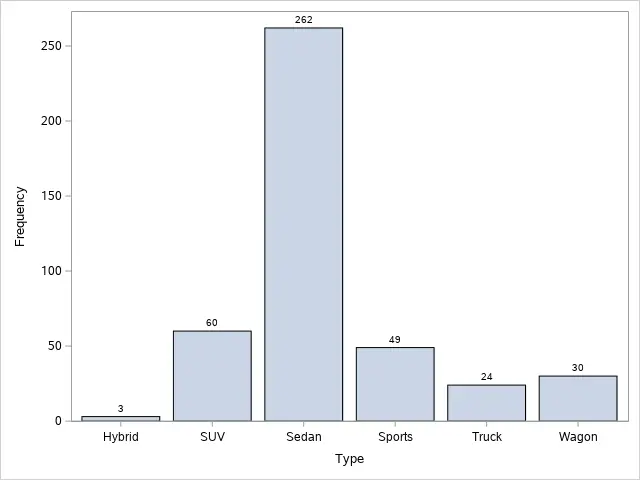
How to Show Data Labels in a Bar Chart in SAS
By default, a bar chart in SAS does not contain data labels. A data label shows the exact value of a category, or subcategory. So, how can you add data labels to a bar chart in SAS?
You add data labels to a bar chart in SAS with the DATALABEL-option. The DATALABEL-option is part of the VBAR and HBAR statement. If you don’t add other options, SAS places the data labels at the end of each bar.
In the example below we demonstrate how to add data labels to a bar chart.
proc sgplot data=sashelp.cars;
    vbar type / datalabel;
run;
Instead, if you work with a grouped bar chart or a stacked bar chart, you need the SEGLABEL option to add data labels. This option produces a data label for each subcategory. For example, below we add data labels for the Origin variable.
proc sgplot data=sashelp.cars;
    vbar type / group=origin groupdisplay=stack seglabel;
run;

Note that, you can combine the DATALABEL and SEGLABEL option.
Data labels are especially useful in segmented bar charts, but the labels are not very readable (in our opinion). You can change the appearance of the data labels with the DATALABELATTRS or SEGLABELATTTRS option. These options modify the appearance of the data labels and segment labels, respectively.
Below we provide an example of how to create a segmented bar chart with readable data labels.
proc sgplot data=sashelp.cars pctlevel=group;
    vbar type / group=origin groupdisplay=stack stat=pct seglabel seglabelattrs=(size=12 color=white);
run;
As expected, SAS can also add data labels to bar charts with a response variable on the Y-axis. In the example below, we add the value of the response variable at the end of each bar.
proc sgplot data=sashelp.cars;
    vbar type / group=origin groupdisplay=cluster response=invoice stat=mean datalabel datalabelattrs=(size=12 color=blue);
run;
How to Modify the Legend of a Bar Chart in SAS
By default, SAS adds a legend to the bottom of a grouped or stacked bar chart. However, you might want to change its location or appearance. So, how do you modify the legend of a bar chart in SAS?
You change the appearance of the legend of a bar chart with the KEYLEGEND statement. This statement starts with the KEYLEGEND keyword, followed by some options to modify its appearance and location. These are the most common options:
- TITLE=-option: With the TITLE=-option, you can specify the title of the legend. By default, the title of the legend is the name of the variable that defines the subcategories. You must place the new title between (double) quotes.
- LOCATION=-option: The LOCATION=-option specifies the location of the legend. You can chose between INSIDE and OUTSIDE (default).
- POSITION=-option: With the POSITION=-option, you define the position of the legend. See this article for the different positions.
- ACROSS=-option: The ACROSS=-option determines the number of columns a legend contains.
Below we show an example of how to change the appearance and location of the legend.
proc sgplot data=sashelp.cars;
    vbar type / group=origin groupdisplay=cluster;
    keylegend / title="Continent" location=inside position=topright  across=1;
run;
How to Order Bars in a Bar Chart in SAS
By default, SAS orders the bars of a bar chart alphabetically based on the category names. However, you might want to order to be based on the values instead of the categories. So, how do you change the order of the bars in a SAS bar chart?
In SAS, you can change the order of the bars in a bar chart with the CATEGORYORDER=-option. This option allows you to order the bars based on the response value both ascendingly and descendingly. For ascending order, you use CATEGORYORDER = RESPASC, while for a descending order you need CATEGORYORDER = RESPDESC.
Below we show two examples of how to order the bars of a bar chart in descending order. In the first example, we order the bars based on the frequency of each category, while in the second example we use the response variable to order the bars.
proc sgplot data=sashelp.cars;
    vbar type / categoryorder=respdesc;
run;
proc sgplot data=sashelp.cars;
    vbar type / response=invoice stat=mean categoryorder=respdesc;
run;
You can also use the CATEGORYORDER=-option to order the bars of a grouped bar chart.
proc sgplot data=sashelp.cars;
    vbar type / response=invoice stat=mean group=origin groupdisplay=cluster categoryorder=respdesc;
run;
How to Modify the Colors of a Bar Chart in SAS
By default, the colors of a grouped and stacked bar chart are blue, red, and green. You might like the colors of these groups, but sometimes it is necessary to change them. So, how do you change the colors in a bar chart in SAS?
You change the colors of the groups in a SAS bar chart with the STYLEATTRS statement. The statement starts with the STYLEATTRS keyword, followed by the DATACOLORS=-option. With the DATACOLORS=-option, you can specify the colors. You can either define the color of each group or choose a color scheme.
SAS offers many color schemes you can choose from. So, it might be difficult to remember them. Fortunately, if you use SAS University Edition, the editor shows a list of all colors after you have written “DATACOLORS=(“.
Below we show an example of how to change the colors of a bar chart in SAS.
/* Colors */
proc sgplot data=sashelp.cars;
    vbar type / group=origin;
    styleattrs datacolors=(bioy);
run;
How to Add Grid Lines to a Bar Chart in SAS
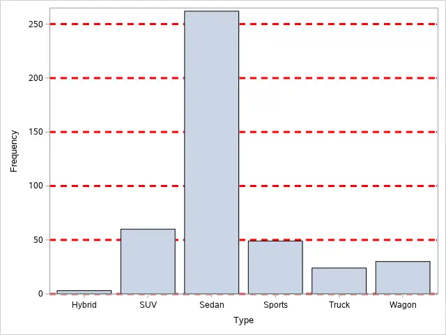
A standard SAS bar chart does not contain gridlines. However, they can be useful to make the chart easier to read. So, how do you add gridlines to a bar chart in SAS?
You add horizontal gridlines to a bar chart in SAS with the YAXIS statement. The statement starts with the YAXIS keyword, followed by the GRID keyword. You can change the appearance of the gridlines with the GRIDATTRS=-options. For example, the line pattern or the color.
In the example below, we add horizontal gridlines to a bar chart. With the GRIDATTRS=-option, we change the default lines to thicker, dashed, red lines.
/* Grid Lines */
proc sgplot data=sashelp.cars;
    vbar type;
    yaxis grid gridattrs=(pattern=dash thickness=3 color=red);
run;
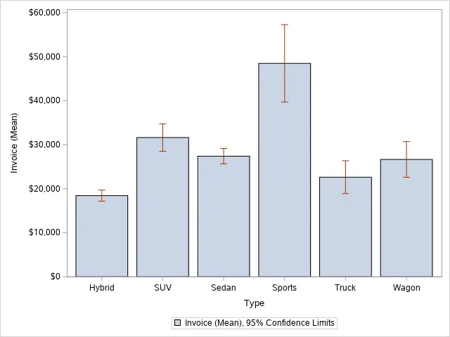
How to Create Error Bars in a Bar Chart in SAS
Another feature of a SAS bar chart is the error bars (or limits). These are line segments with a serif at the end.
You can add error bars to a bar chart in SAS with the LIMITS=-option. If you use LIMITS = BOTH, SAS adds the upper and lower limit of each bar to the plot. With the LIMITSTAT=-option, you can specify the statistic of the limit. If you only use the LIMIT=-option, then the limits are the 95% confidence limits.
Also, you can use LIMITSTAT = STDDEV to show the standard deviation or LIMITSTAT = STDERR for the standard error.
In the example below, we add the lower and upper confidence limits to a bar chart (i.e., error bars).
proc sgplot data=sashelp.cars;
    vbar type / response=invoice stat=mean limits=both;
run;
2 thoughts on “How to Easily Create a Bar Chart in SAS”
Comments are closed.