In this article, we discuss how to create a boxplot in SAS.
We show how to create a basic boxplot as well as how to create a boxplot per group. We also demonstrate how to customize the appearance of a boxplot and how to use a boxplot to find outliers.
In short, you create a boxplot in SAS with the SGPLOT procedure. You only need to define your input dataset with the DATA=-option, and the variable you want to plot with the VBOX statement. After that, you can add various options to enhance the boxplot.
Before we show examples of how to create a boxplot, we first discuss how to interpret a SAS boxplot.
Contents
What is a Boxplot?
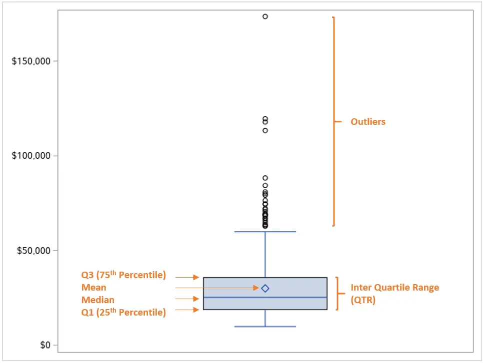
A boxplot is a standardized way to show the distribution of a variable. Although boxplot can differ, they always show at least these 5 statistics:
- The minimum
- The first quartile
- The median
- The third quartile
- The maximum
Besides these statistics, a boxplot in SAS also shows by default the mean, the boxplot whiskers, and the outliers.
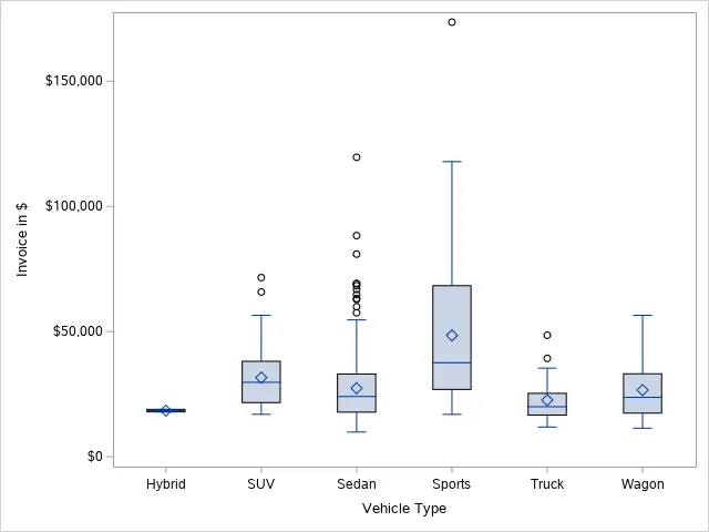
This is an example of a default boxplot in SAS.
For more information about boxplots, we recommend reading this article.
How to Create a Boxplot in SAS?
You create a boxplot in SAS with the SGPLOT procedure. This procedure requires two inputs:
- The DATA=-option: With the DATA=-option, you specify the name of the input dataset that contains the variable you want to plot.
- The VBOX statement: The VBOX statement lets SAS know to create a boxplot. After the VBOX keyword, you specify the variable you want to show. Additionally, you can add more options to customize the appearance of the boxplot.
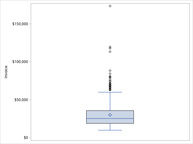
With the example below, we create a basic boxplot of the invoice variable from the CARS dataset in the SASHELP library.
/* How to Create a Boxplot */
proc sgplot data=sashelp.cars;
    vbox invoice;
run;
As you can see, we use the DATA=-option to specify the input dataset. With the VBOX statement, we create a boxplot of the invoice variable.
How to Create a Boxplot per Category?
As mentioned above, you only need the VBOX statement to create a simple boxplot in SAS. However, you might want to compare the distribution of a variable amongst different categories (i.e., different levels) of a second variable. So, how do you create multiple boxplots in SAS?
The SGPLOT procedure in SAS can create a boxplot of different categories. You need to specify 3 inputs:
- The DATA=-option. You specify the input dataset with the DATA=-option.
- The VBOX statement. The VBOX statement creates the boxplot. You start this statement with the VBOX keyword followed by the variable you want to plot.
- The CATEGORY=-option. With the CATEGORY=-option, you can specify the variable that defines the different categories in the boxplot. This option is part of the VBOX statement.
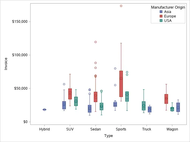
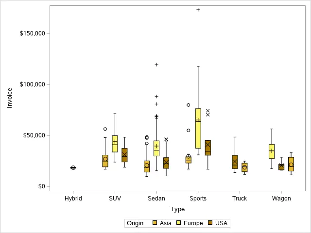
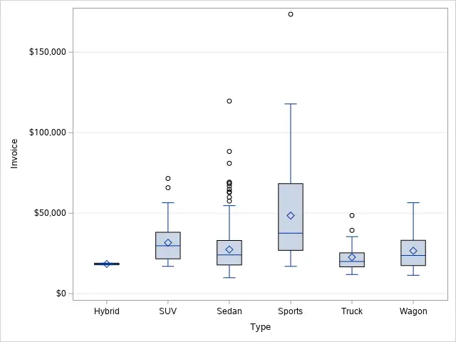
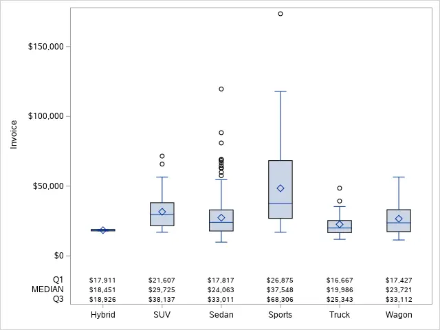
In the example below, we use the SGPLOT procedure to create a boxplot of the invoice variable for each type of car (i.e., Hybrid, SUV, Sedan, etc.).
/* How to Create a Boxplot with a Category Variable */
proc sgplot data=sashelp.cars;
    vbox invoice / category=type;
run;
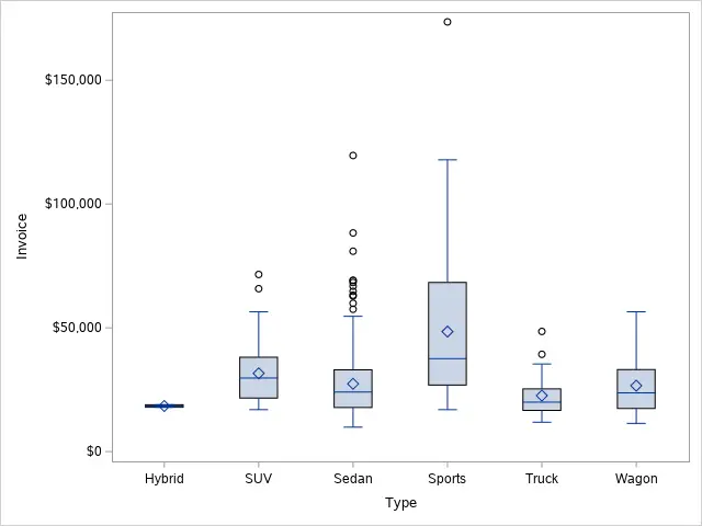
As you can see in the image above, SAS orders the categories of a boxplot alphabetically. However, you can change the order with the VALUES=-option.
How to Create a Boxplot by Group?
Besides creating a boxplot per category, you can also create a boxplot per group.
You create a SAS boxplot per group with the SGPLOT procedure and the VBOX statement. The VBOX statement starts with the VBOX keyword, followed by the variable you want to plot. Then, after a forward-slash, you use the CATEGORY=-option and the GROUP=-option to create a boxplot per group.
With the SAS code below, we create a boxplot by group.
/* How to Create a Boxplot with a Category Variable */
proc sgplot data=sashelp.cars;
    vbox invoice / category=type group=origin;
run;
In the boxplot above, we used both the CATEGORY=-option and the GROUP=-option. Nevertheless, you can use these options separately.
The difference between the CATEGORY=-option and the GROUP=-option is that the CATEGORY=-option shows the categories on the X-axis while the GROUP=-option creates a legend with all groups.
How to Customize the Appearance of a Boxplot in SAS?
A default boxplot might be a bit boring or not completely self-explaining. Therefore, in this section, we discuss how to customize the appearance of a boxplot in SAS.
How to Change the Labels of a Boxplot?
A frequently asked question is how to change the labels of a boxplot.
You can change the appearance of the X-axis of a boxplot with the XAXIS statement. Similarly, with the YAXIS statement, you modify the Y-axis. Then, with the LABEL=-option, you define the new label of the axis.
In the example below, we use the LABEL=-option to change the labels of the X-axis and the Y-axis. You must always write the new labels between double quotes.
/* How to Change the Labels of a Boxplot */
proc sgplot data=sashelp.cars;
    vbox invoice / category=type;

    xaxis label="Vehicle Type";
    yaxis label="Invoice in $";
run;
You can also remove the labels of the X-axis and Y-axis.
To remove the label of an axis you need the DISPLAY=-option. If you use DISPLAY=(nolabel), then SAS will remove the label from the axis.
In the example below we show how to use the DISPLAY=-option.
/* How to Remove the Labels from a Boxplot */
proc sgplot data=sashelp.cars;
    vbox invoice / category=type;

    xaxis display=(nolabel);
    yaxis display=(nolabel);
run;
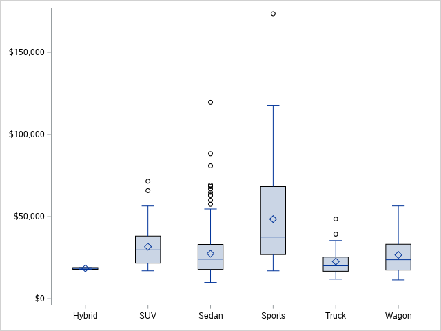
Notice that the boxplot above has neither labels on the X-axis, nor on the Y-axis.
Do you know: How to Create a Title in SAS?
How to Add a Legend to a Boxplot?
If you create a boxplot per group, SAS automatically adds a legend to the plot. But, how do you control this legend?
You modify the legend of a boxplot in SAS with the KEYLEGEND statement. For example, with the TITLE=-option, you change the title. Similarly, with the LOCATION=-option and the POSITION=-option, you control the location of the legend.
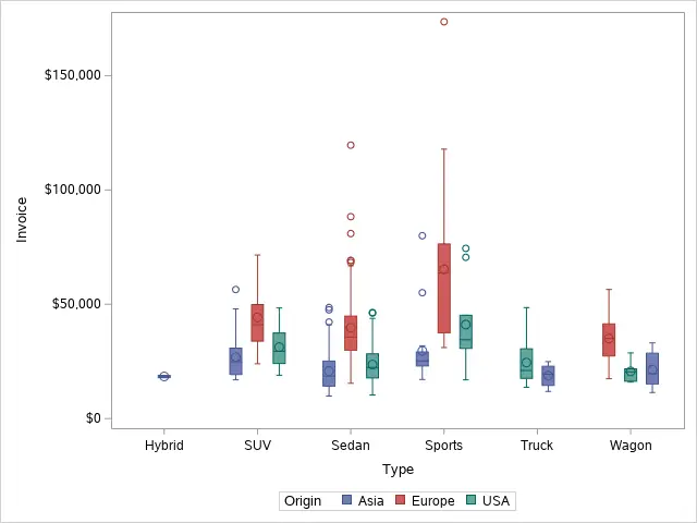
With the SAS code below, we move the legend of the boxplot to the top right corner inside the plot area. We also change the title.
/* How to Add a Legend to a Boxplot */
proc sgplot data=sashelp.cars;
    vbox invoice / category=type group=origin;

    keylegend / title="Manufacturer Origin" location=inside position=topright across=1;
run;
How to Change the Colors of a Boxplot?
By default, the colors in a boxplots in SAS are blue, red, and green. However, you can change this.
You change the colors of a boxplot with the STYLEATTRS statement. With the DATACOLORS=-option, you modify the fill colors of the boxplot. You can use the DATACONTRASTCOLORS=-option to change the colors of the outline and other symbols.
In the example below, we demonstrate how to use the STYLEATTRS statement to modify the colors in a boxplot.
/* How to Change the Colors of a Boxplot */
proc sgplot data=sashelp.cars;
    vbox invoice / category=type group=origin;

    styleattrs datacolors=(bioy) datacontrastcolors=(black);
run;
How to Add Gridlines to a Boxplot?
By default, a boxplot in SAS doesn’t contain gridlines. However, if you need them, you can add them.
You can add gridlines to a boxplot with the GRID option of the YAXIS statement. This option will add a horizontal gridline to the boxplot at each tick mark of the Y-axis.
/* How to Add Gridlines to a Boxplot */
proc sgplot data=sashelp.cars;
    vbox invoice / category=type;

    yaxis grid;
run;
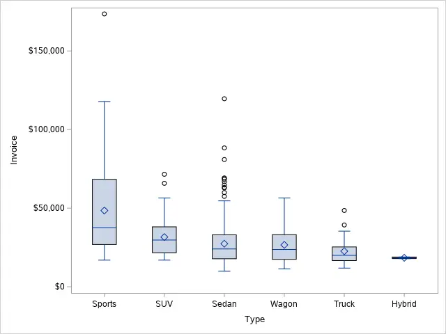
How to Change the Order of a Boxplot?
As mentioned before, SAS orders the categories on the X-axis alphabetically. Nevertheless, you can change the order of the categories in a boxplot with the VALUES=-option of the XAXIS statement.
In the example below, we change the order of the categories explicitly with the VALUES=-option. You need to write the new order between parenthesis and double-quotes.
/* How to Order a Boxplot */
proc sgplot data=sashelp.cars;
    vbox invoice / category=type;

    xaxis values=("Sports" "SUV" "Sedan" "Wagon" "Truck" "Hybrid");
run;
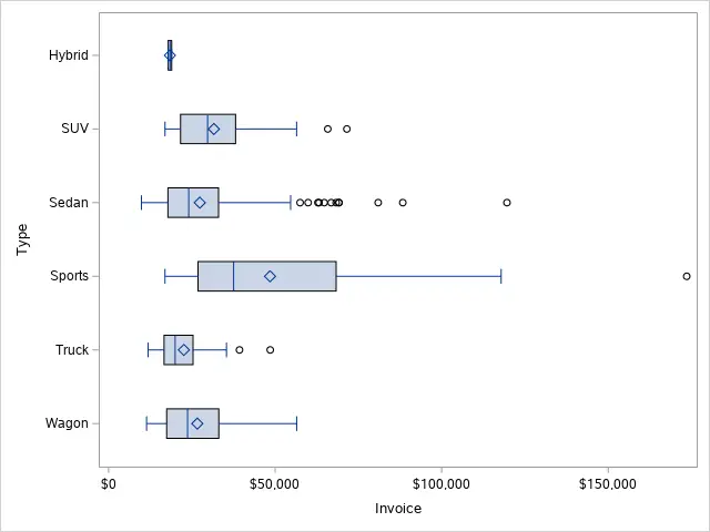
How to Create a Horizontal Boxlot?
Most of the boxplots we see are vertical boxplots. However, you can also create horizontal boxplots in SAS.
To create a horizontal boxplot in SAS you need the HBOX statement. After the HBOX keyword, you specify the variable you want to plot. Additionally, you can specify extra options to customize the appearance of the boxplot.
In the example below, we create a horizontal boxplot with the HBOX statement.
/* How to Create a Horizontal Boxplot */
proc sgplot data=sashelp.cars;
    hbox invoice / category=type;
run;
How to Add Summary Statistics to a Boxplot in SAS?
Boxplots are very useful to assess the distribution of a variable because they show you the mean, the median, percentiles, etc. However, the exact values of these statistics are not always readable. So, how do you add a table with summary statistics to a boxplot in SAS?
Adding a table with summary statistics to a SAS boxplot is a 4 step process. These are the steps:
- Calculate the Summary Statistics
You can calculate the values of the summary statistics, e.g. the mean, the median, or the 75%-percentile, with a boxplot. To save these values in a table, you need to the ODS statement.
The ODS statement starts with the ODS keyword, followed by the OUTPUT SGPLOT=-option. With this option, you specify the name of the table that contains the summary statistics. - Select the Summary Statistics
The ODS output dataset has a lot of information. So, you need to filter only the summary statistics you want to show. Also, we recommend selecting and renaming the variables of the output dataset.
SAS calculates the following statistics:
– Minimum
– Q1 (25% percentile)
– Median
– Q3 (75% percentile)
– Maximum
– Mean
– Standard Deviation
– Number of Observations
– (Far) Outliers
– Overall Minimum
– Overall Maximum - Combine the Original Data with the Summary Statistics
Before you create the boxplot with the summary statistics, you need to combine the original dataset with the dataset that contains the summary statistics. You can do this by appending both datasets with the SET statement.
- Create the Boxplot with the Summary Stastitics
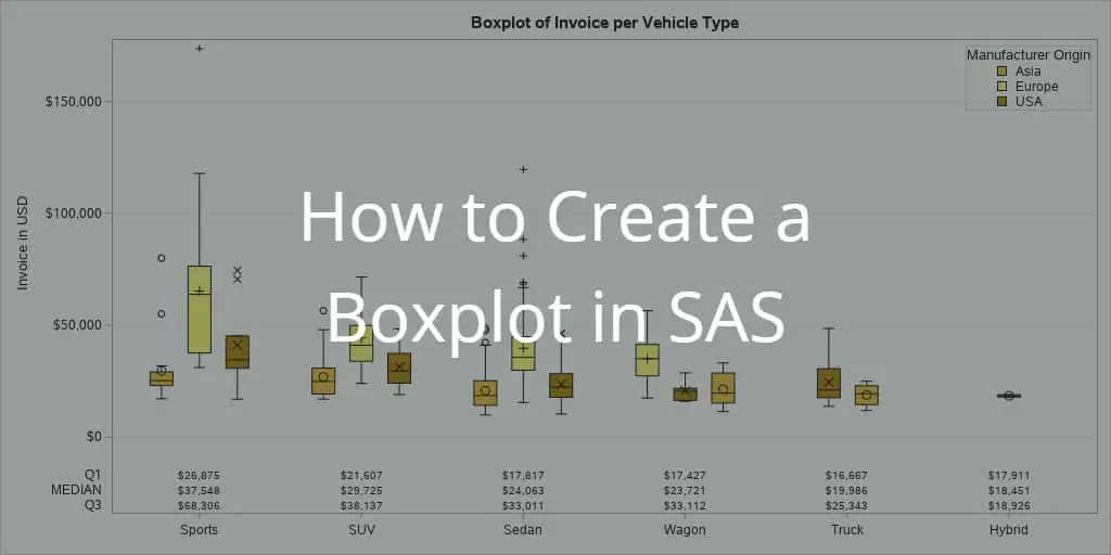
Now you can create the boxplot with the summary statistics. You create a normal boxplot and add the XAXISTABLE statement to show the table with statistics. This statement also allows you to specify the location of the statistics.
The SAS code below contains all the steps we’ve mentioned above.
/* How to Add Summary Statistics to a Boxplot */
ods output sgplot=work.sgplotdata;
proc sgplot data=sashelp.cars;
    vbox invoice / category=type;
run;

data work.boxplot_statistics (keep = Value Statistic Category);
    set work.sgplotdata
	(rename=(BOX_INVOICE_X_TYPE____Y = Value
		BOX_INVOICE_X_TYPE___ST = Statistic
		BOX_INVOICE_X_TYPE____X = Category));
    where not missing(Value)
		and Statistic in("MEDIAN" "Q1" "Q3");
run;

data work.cars_and_statistics;
    set sashelp.cars
	work.boxplot_statistics;
run;

proc sgplot data=work.cars_and_statistics;
    vbox invoice / category=type;
    xaxistable Value / x=Category class=Statistic location=inside;
    xaxis display=(nolabel);
run;
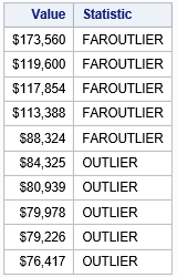
How to Find Outliers with a Boxplot in SAS?
Boxplots are a useful tool to identify outliers. Each outlier is plotted as a single point. However, how do you find the exact value of the outliers in a boxplot?
You can find the outliers of a boxplot by placing an ODS OUTPUT statement right before the code that generates the boxplot. The ODS OUTPUT statement creates a table with all the statistics of the boxplot. Two of these statistics are the FAROUTLIER and the OUTLIER.
The ODS OUTPUT creates a SAS dataset of an output object (such as a boxplot). In order to save the statistics of a boxplot (created with the SGPLOT procedure), you need to add the SGPLOT=-option. With this option you specify the name of the dataset that will contain the summary statistics.
The output dataset that the ODS statement generates has many different statistics. To get the outliers, you need to filter the FAROUTLIER and OUTLIER categories. In the example below, we use the FIND function to filter the outliers.
Finally, we recommend selecting and renaming the variables from the ODS output dataset. You can do this with the KEEP=-option and the RENAME=-option.
In the example below, we show how to filter the outliers of the invoice variable from the CARS dataset in the SASHELP library.
/* How to Find Outliers with a Boxplot */
ods output sgplot=work.sgplotdata;
proc sgplot data=sashelp.cars;
    vbox invoice;
run;

data work.outliers (keep = Value Statistic);
    set work.sgplotdata
	(rename=(BOX_INVOICE____Y = Value
		BOX_INVOICE___ST = Statistic));
    where find(Statistic, "OUTLIER") gt 0;
run;

proc print data=work.outliers (obs=10) noobs;
run;
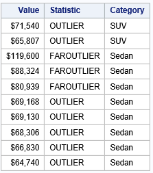
You can use the strategy mentioned above also to find the outliers per category (or group).
/* How to Find Outliers with a Boxplot (per Category) */
ods output sgplot=work.sgplotdata;
proc sgplot data=sashelp.cars;
    vbox invoice / category=type;
run;

data work.outliers (keep = Value Statistic Category);
    set work.sgplotdata
	(rename=(BOX_INVOICE_X_TYPE____Y = Value
		BOX_INVOICE_X_TYPE___ST = Statistic
		BOX_INVOICE_X_TYPE____X = Category));
    where find(Statistic, "OUTLIER") > 0;
run;

proc print data=work.outliers (obs=10) noobs;
run;
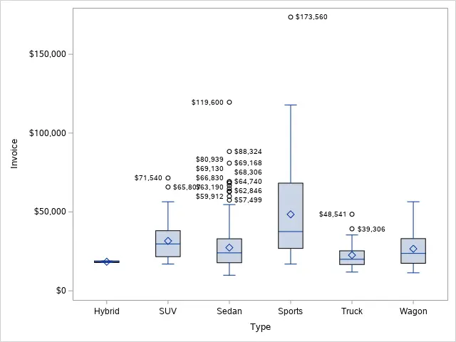
Finally, if you are only interested in the values of the outliers, you can use the DATALABEL option to add the exact values of the outliers to the boxplot.
/* How to Add Labels to Outliers in a Boxplot */
proc sgplot data=sashelp.cars;
    vbox invoice / category=type datalabel;
run;


One thought on “How to Easily Create a Boxplot in SAS”
Comments are closed.